
Form Builder - Fields
Getting started
Overview
Field classes can be found in the Filament\Form\Components namespace.
Fields reside within the schema of your form, alongside any layout components.
Fields may be created using the static make() method, passing its unique name. The name of the field should correspond to a property on your Livewire component. You may use "dot notation" to bind fields to keys in arrays.
use Filament\Forms\Components\TextInput; TextInput::make('name')

Available fields
Filament ships with many types of field, suitable for editing different types of data:
- Text input
- Select
- Checkbox
- Toggle
- Checkbox list
- Radio
- Date-time picker
- File upload
- Rich editor
- Markdown editor
- Repeater
- Builder
- Tags input
- Textarea
- Key-value
- Color picker
- Toggle buttons
- Hidden
You may also create your own custom fields to edit data however you wish.
Setting a label
By default, the label of the field will be automatically determined based on its name. To override the field's label, you may use the label() method. Customizing the label in this way is useful if you wish to use a translation string for localization:
use Filament\Forms\Components\TextInput; TextInput::make('name') ->label(__('fields.name'))Optionally, you can have the label automatically translated using Laravel's localization features with the translateLabel() method:
use Filament\Forms\Components\TextInput; TextInput::make('name') ->translateLabel() // Equivalent to `label(__('Name'))`Setting an ID
In the same way as labels, field IDs are also automatically determined based on their names. To override a field ID, use the id() method:
use Filament\Forms\Components\TextInput; TextInput::make('name') ->id('name-field')Setting a default value
Fields may have a default value. This will be filled if the form's fill() method is called without any arguments. To define a default value, use the default() method:
use Filament\Forms\Components\TextInput; TextInput::make('name') ->default('John')Note that these defaults are only used when the form is loaded without existing data. Inside panel resources this only works on Create Pages, as Edit Pages will always fill the data from the model.
Adding helper text below the field
Sometimes, you may wish to provide extra information for the user of the form. For this purpose, you may add helper text below the field.
The helperText() method is used to add helper text:
use Filament\Forms\Components\TextInput; TextInput::make('name') ->helperText('Your full name here, including any middle names.')This method accepts a plain text string, or an instance of Illuminate\Support\HtmlString or Illuminate\Contracts\Support\Htmlable. This allows you to render HTML, or even markdown, in the helper text:
use Filament\Forms\Components\TextInput;use Illuminate\Support\HtmlString; TextInput::make('name') ->helperText(new HtmlString('Your <strong>full name</strong> here, including any middle names.')) TextInput::make('name') ->helperText(str('Your **full name** here, including any middle names.')->inlineMarkdown()->toHtmlString()) TextInput::make('name') ->helperText(view('name-helper-text'))

Adding a hint next to the label
As well as helper text below the field, you may also add a "hint" next to the label of the field. This is useful for displaying additional information about the field, such as a link to a help page.
The hint() method is used to add a hint:
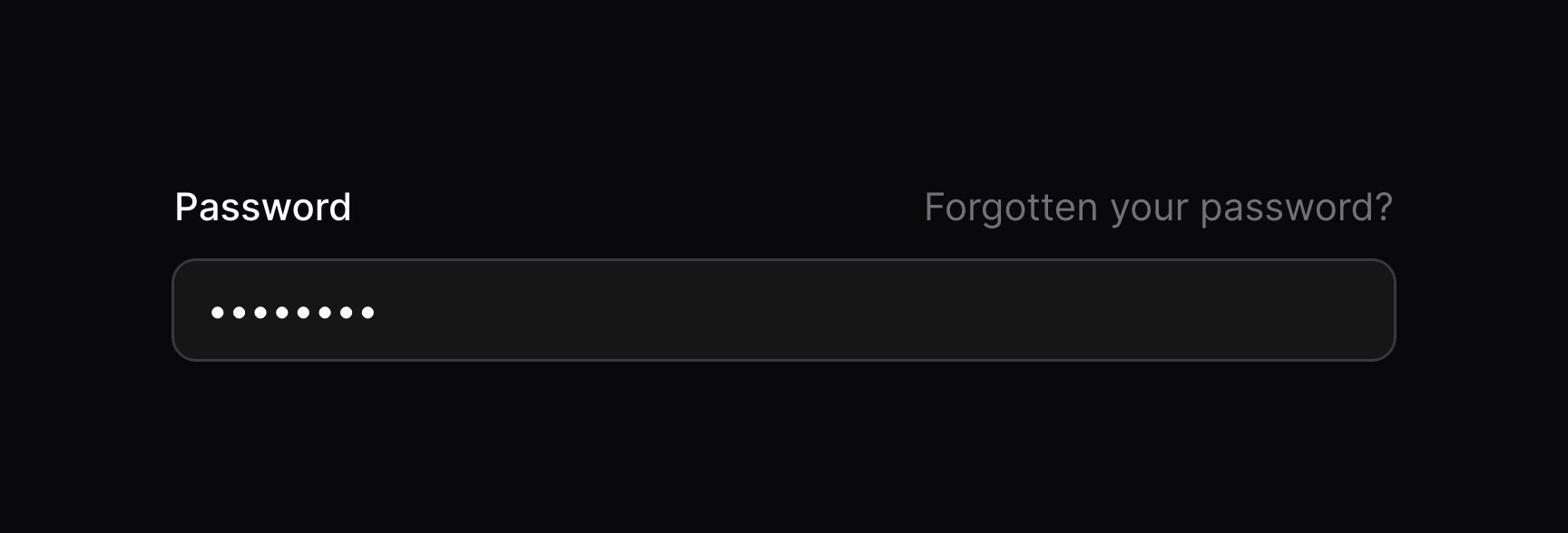
use Filament\Forms\Components\TextInput; TextInput::make('password') ->hint('Forgotten your password? Bad luck.')This method accepts a plain text string, or an instance of Illuminate\Support\HtmlString or Illuminate\Contracts\Support\Htmlable. This allows you to render HTML, or even markdown, in the helper text:
use Filament\Forms\Components\TextInput;use Illuminate\Support\HtmlString; TextInput::make('password') ->hint(new HtmlString('<a href="/forgotten-password">Forgotten your password?</a>')) TextInput::make('password') ->hint(str('[Forgotten your password?](/forgotten-password)')->inlineMarkdown()->toHtmlString()) TextInput::make('password') ->hint(view('forgotten-password-hint'))
Changing the text color of the hint
You can change the text color of the hint. By default, it's gray, but you may use danger, info, primary, success and warning:
use Filament\Forms\Components\RichEditor; RichEditor::make('content') ->hint('Translatable') ->hintColor('primary')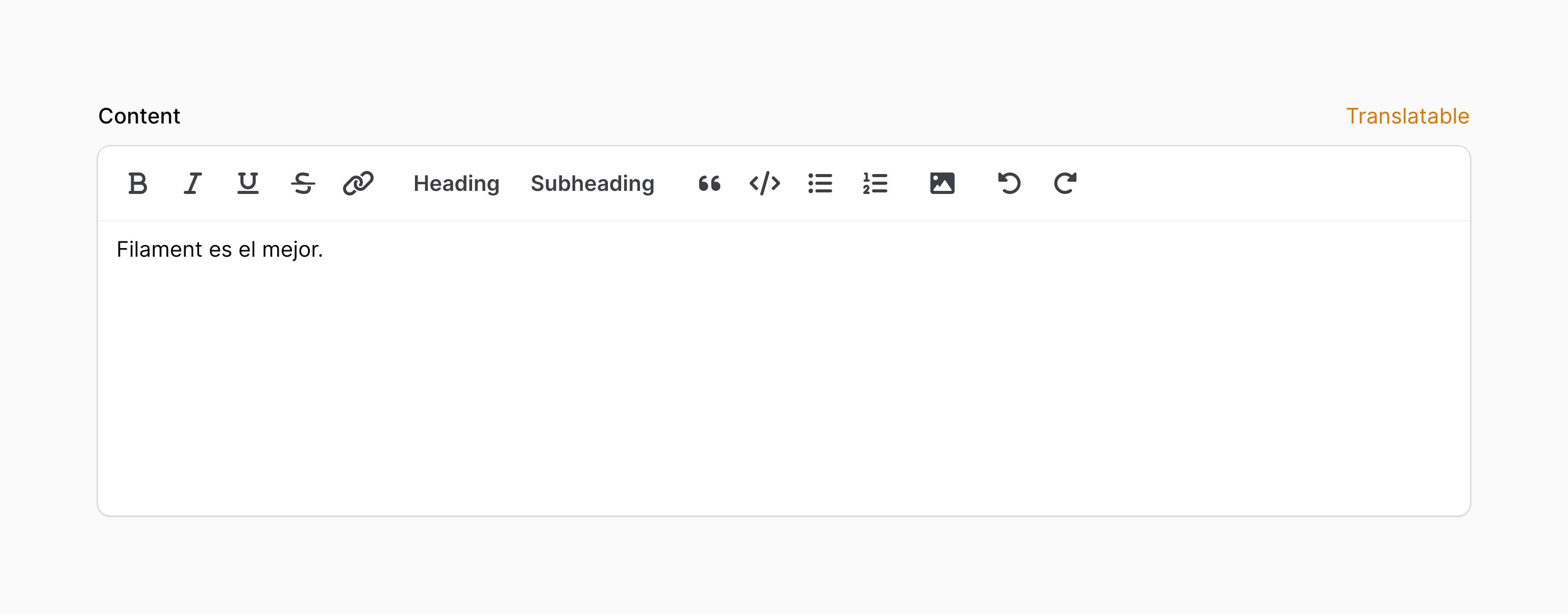
Adding an icon aside the hint
Hints may also have an icon rendered next to them:
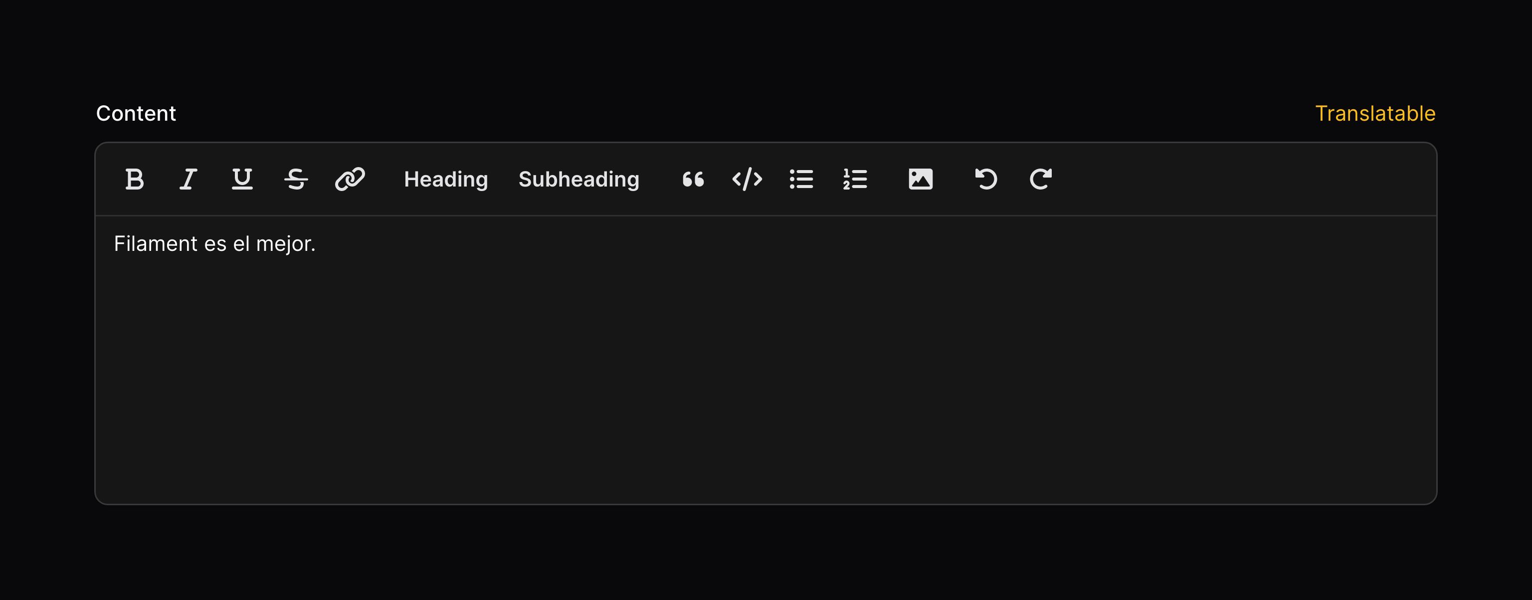
use Filament\Forms\Components\RichEditor; RichEditor::make('content') ->hint('Translatable') ->hintIcon('heroicon-m-language')
Adding a tooltip to a hint icon
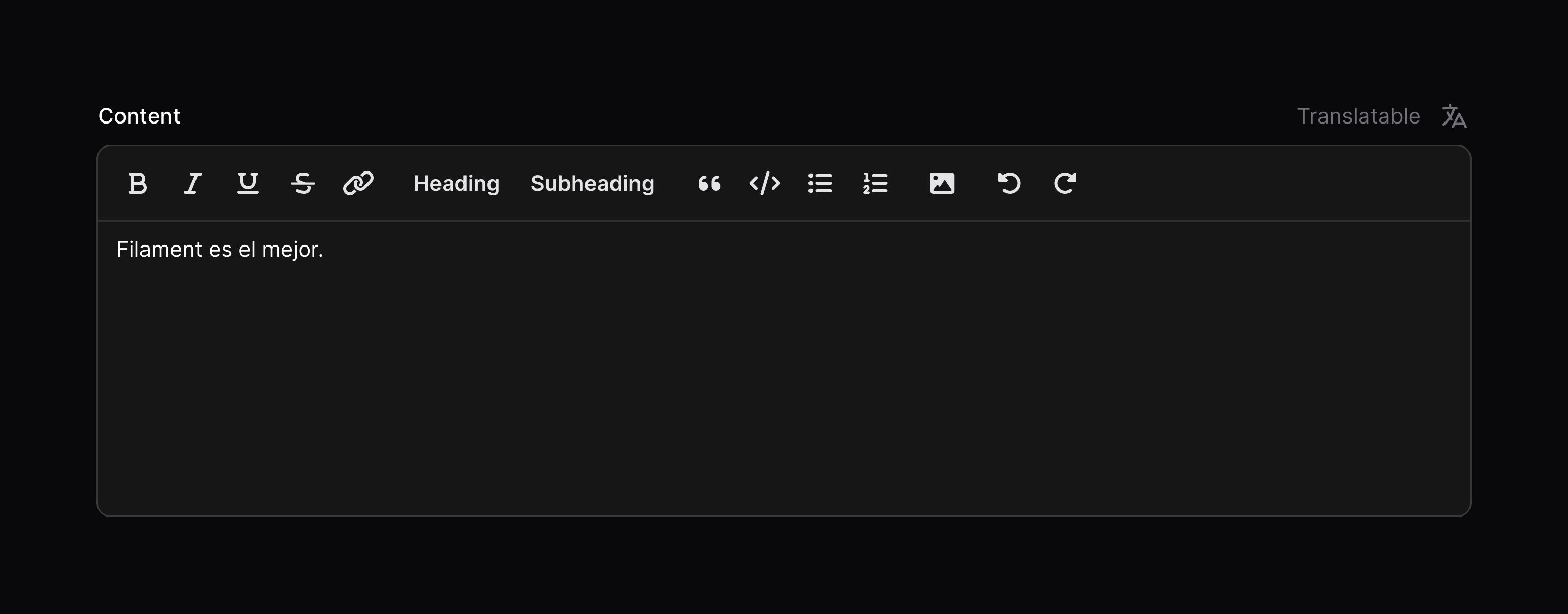
Additionally, you can add a tooltip to display when you hover over the hint icon, using the tooltip parameter of hintIcon():
use Filament\Forms\Components\TextInput; TextInput::make('name') ->hintIcon('heroicon-m-question-mark-circle', tooltip: 'Need some more information?')Adding extra HTML attributes
You can pass extra HTML attributes to the field, which will be merged onto the outer DOM element. Pass an array of attributes to the extraAttributes() method, where the key is the attribute name and the value is the attribute value:
use Filament\Forms\Components\TextInput; TextInput::make('name') ->extraAttributes(['title' => 'Text input'])Some fields use an underlying <input> or <select> DOM element, but this is often not the outer element in the field, so the extraAttributes() method may not work as you wish. In this case, you may use the extraInputAttributes() method, which will merge the attributes onto the <input> or <select> element:
use Filament\Forms\Components\TextInput; TextInput::make('categories') ->extraInputAttributes(['width' => 200])Disabling a field
You may disable a field to prevent it from being edited by the user:
use Filament\Forms\Components\TextInput; TextInput::make('name') ->disabled()

Optionally, you may pass a boolean value to control if the field should be disabled or not:
use Filament\Forms\Components\Toggle; Toggle::make('is_admin') ->disabled(! auth()->user()->isAdmin())Disabling a field will prevent it from being saved. If you'd like it to be saved, but still not editable, use the dehydrated() method:
Toggle::make('is_admin') ->disabled() ->dehydrated()If you choose to dehydrate the field, a skilled user could still edit the field's value by manipulating Livewire's JavaScript.
Hiding a field
You may hide a field:
use Filament\Forms\Components\TextInput; TextInput::make('name') ->hidden()Optionally, you may pass a boolean value to control if the field should be hidden or not:
use Filament\Forms\Components\TextInput; TextInput::make('name') ->hidden(! auth()->user()->isAdmin())Autofocusing a field when the form is loaded
Most fields are autofocusable. Typically, you should aim for the first significant field in your form to be autofocused for the best user experience. You can nominate a field to be autofocused using the autofocus() method:
use Filament\Forms\Components\TextInput; TextInput::make('name') ->autofocus()Setting a placeholder
Many fields will also include a placeholder value for when it has no value. This is displayed in the UI but not saved if the field is submitted with no value. You may customize this placeholder using the placeholder() method:
use Filament\Forms\Components\TextInput; TextInput::make('name') ->placeholder('John Doe')

Marking a field as required
By default, required fields will show an asterisk * next to their label. You may want to hide the asterisk on forms where all fields are required, or where it makes sense to add a hint to optional fields instead:
use Filament\Forms\Components\TextInput; TextInput::make('name') ->required() // Adds validation to ensure the field is required ->markAsRequired(false) // Removes the asteriskIf your field is not required(), but you still wish to show an asterisk * you can use markAsRequired() too:
use Filament\Forms\Components\TextInput; TextInput::make('name') ->markAsRequired()Global settings
If you wish to change the default behaviour of a field globally, then you can call the static configureUsing() method inside a service provider's boot() method or a middleware. Pass a closure which is able to modify the component. For example, if you wish to make all checkboxes inline(false), you can do it like so:
use Filament\Forms\Components\Checkbox; Checkbox::configureUsing(function (Checkbox $checkbox): void { $checkbox->inline(false);});Of course, you are still able to overwrite this behaviour on each field individually:
use Filament\Forms\Components\Checkbox; Checkbox::make('is_admin') ->inline()Still need help? Join our Discord community or open a GitHub discussion