
Infolist Builder - Entries
Icon entry
Overview
Icon entries render an icon representing their contents:
use Filament\Infolists\Components\IconEntry; IconEntry::make('status') ->icon(fn (string $state): string => match ($state) { 'draft' => 'heroicon-o-pencil', 'reviewing' => 'heroicon-o-clock', 'published' => 'heroicon-o-check-circle', })In the function, $state is the value of the entry, and $record can be used to access the underlying Eloquent record.
Customizing the color
Icon entries may also have a set of icon colors, using the same syntax. They may be either danger, gray, info, primary, success or warning:
use Filament\Infolists\Components\IconEntry; IconEntry::make('status') ->color(fn (string $state): string => match ($state) { 'draft' => 'info', 'reviewing' => 'warning', 'published' => 'success', default => 'gray', })In the function, $state is the value of the entry, and $record can be used to access the underlying Eloquent record.
Customizing the size
The default icon size is IconEntrySize::Large, but you may customize the size to be either IconEntrySize::ExtraSmall, IconEntrySize::Small, IconEntrySize::Medium, IconEntrySize::ExtraLarge or IconEntrySize::TwoExtraLarge:
use Filament\Infolists\Components\IconEntry; IconEntry::make('status') ->size(IconEntry\IconEntrySize::Medium)
Handling booleans
Icon entries can display a check or cross icon based on the contents of the database entry, either true or false, using the boolean() method:
use Filament\Infolists\Components\IconEntry; IconEntry::make('is_featured') ->boolean()If this column in the model class is already cast as a
boolorboolean, Filament is able to detect this, and you do not need to useboolean()manually.
Customizing the boolean icons
You may customize the icon representing each state. Icons are the name of a Blade component present. By default, Heroicons are installed:
use Filament\Infolists\Components\IconEntry; IconEntry::make('is_featured') ->boolean() ->trueIcon('heroicon-o-check-badge') ->falseIcon('heroicon-o-x-mark')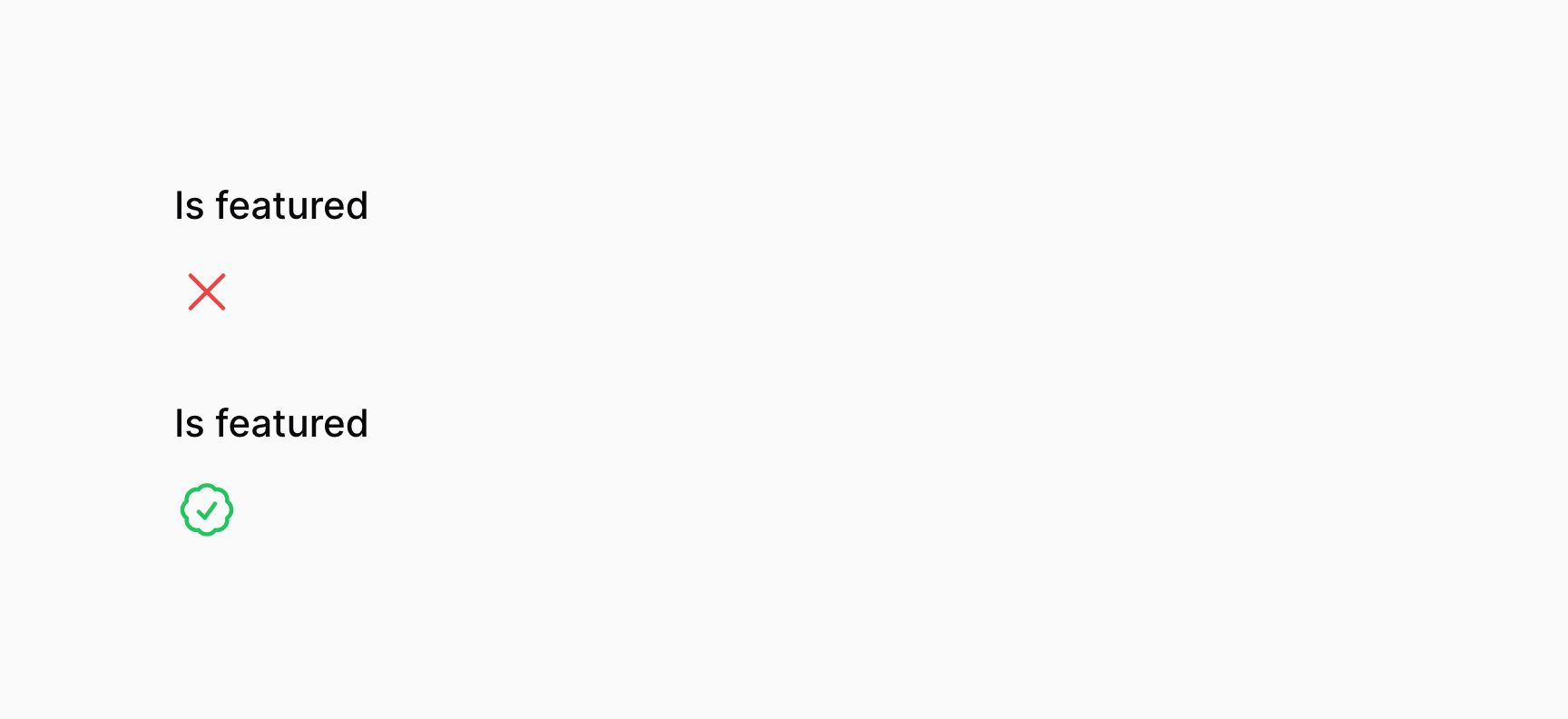
Customizing the boolean colors
You may customize the icon color representing each state. These may be either danger, gray, info, primary, success or warning:
use Filament\Infolists\Components\IconEntry; IconEntry::make('is_featured') ->boolean() ->trueColor('info') ->falseColor('warning')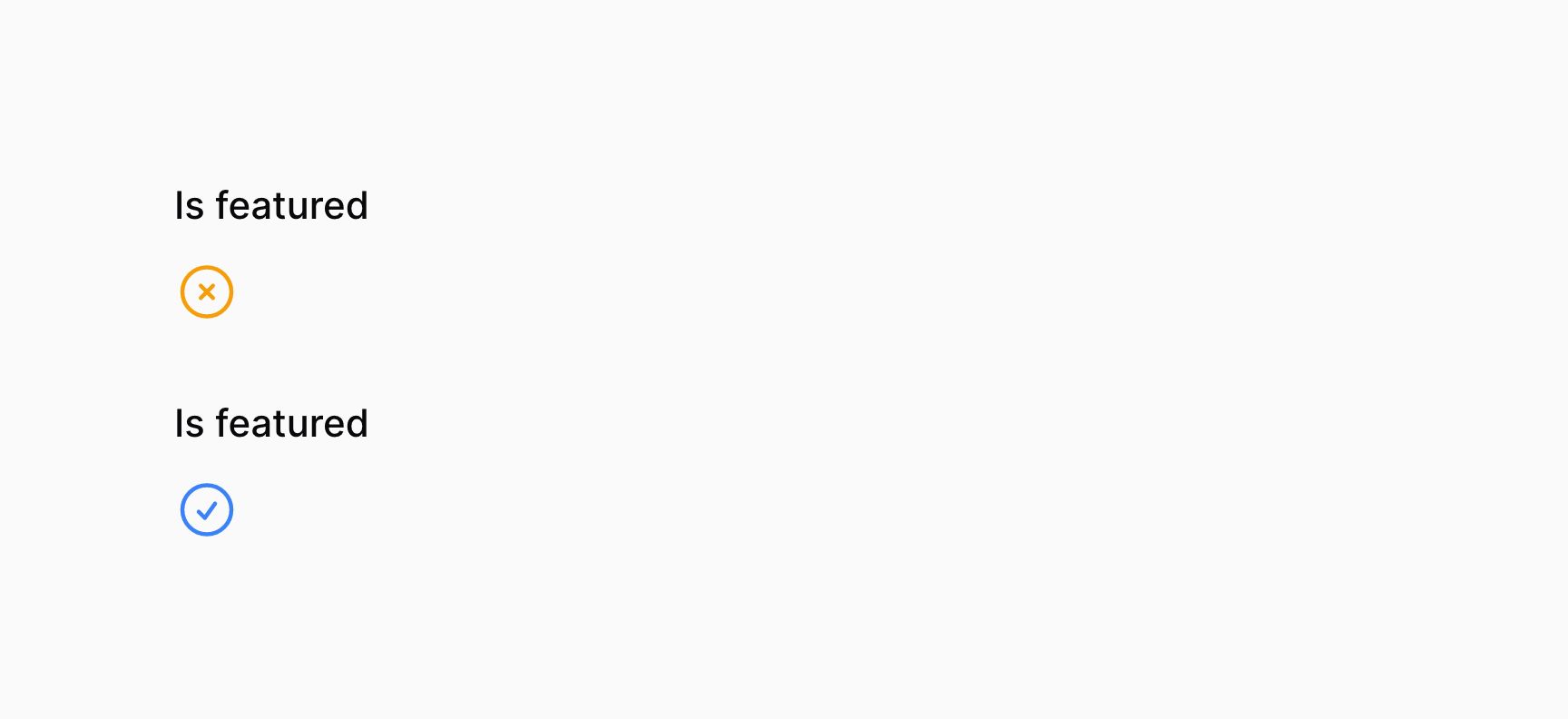
Still need help? Join our Discord community or open a GitHub discussion