
Table Builder
Layout
The problem with traditional table layouts
Traditional tables are notorious for having bad responsiveness. On mobile, there is only so much flexibility you have when rendering content that is horizontally long:
- Allow the user to scroll horizontally to see more table content
- Hide non-important columns on smaller devices
Both of these are possible with Filament. Tables automatically scroll horizontally when they overflow anyway, and you may choose to show and hide columns based on the responsive breakpoint of the browser. To do this, you may use a visibleFrom() or hiddenFrom() method:
use Filament\Tables\Columns\TextColumn; TextColumn::make('slug') ->visibleFrom('md')This is fine, but there is still a glaring issue - on mobile, the user is unable to see much information in a table row at once without scrolling.
Thankfully, Filament lets you build responsive table-like interfaces, without touching HTML or CSS. These layouts let you define exactly where content appears in a table row, at each responsive breakpoint.


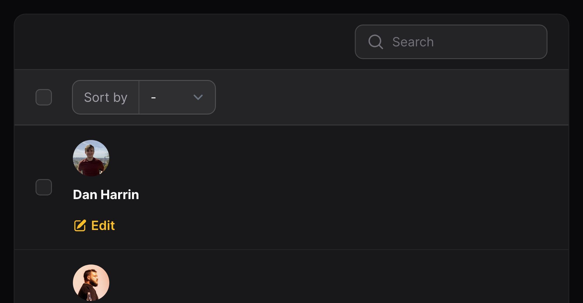
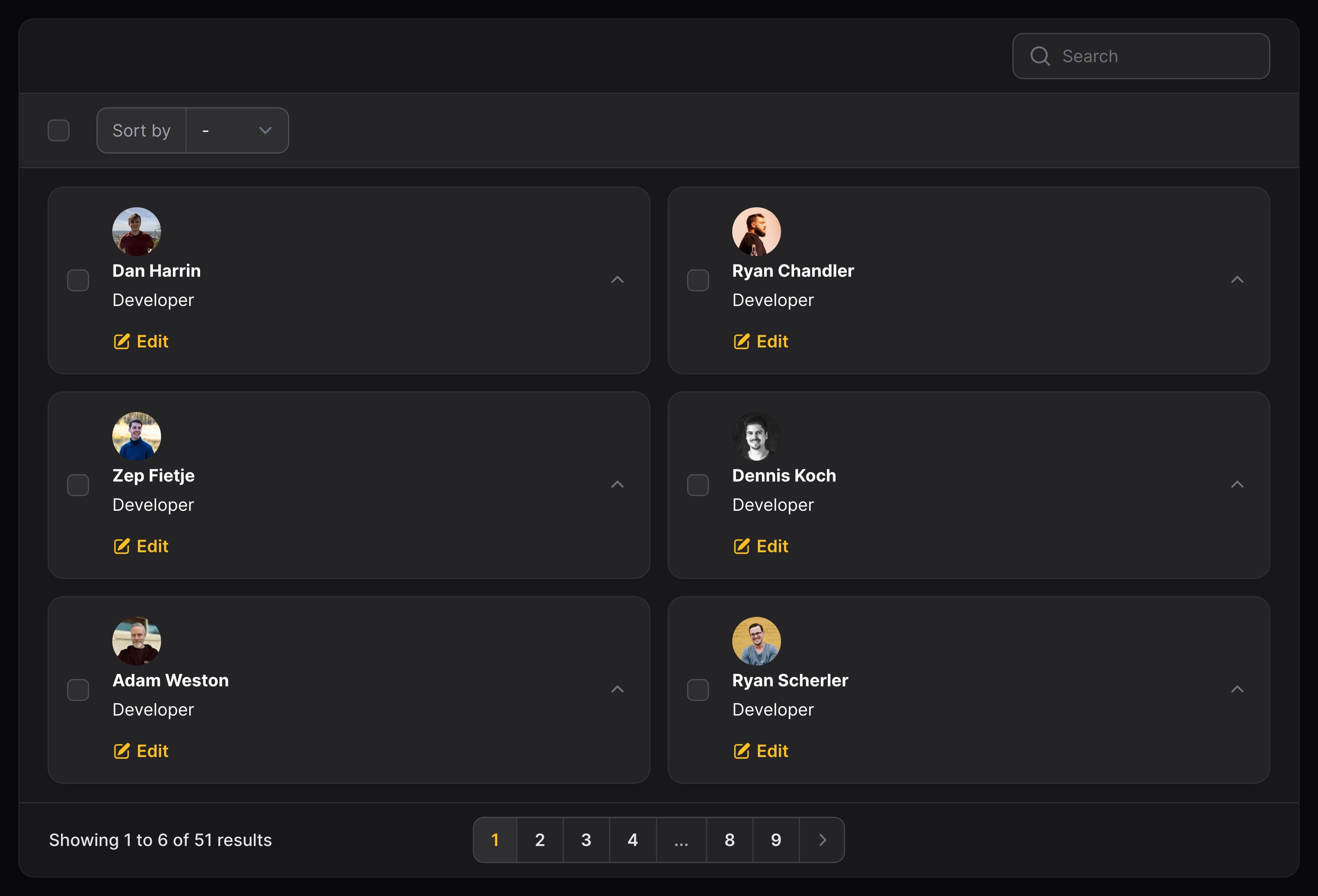
Allowing columns to stack on mobile
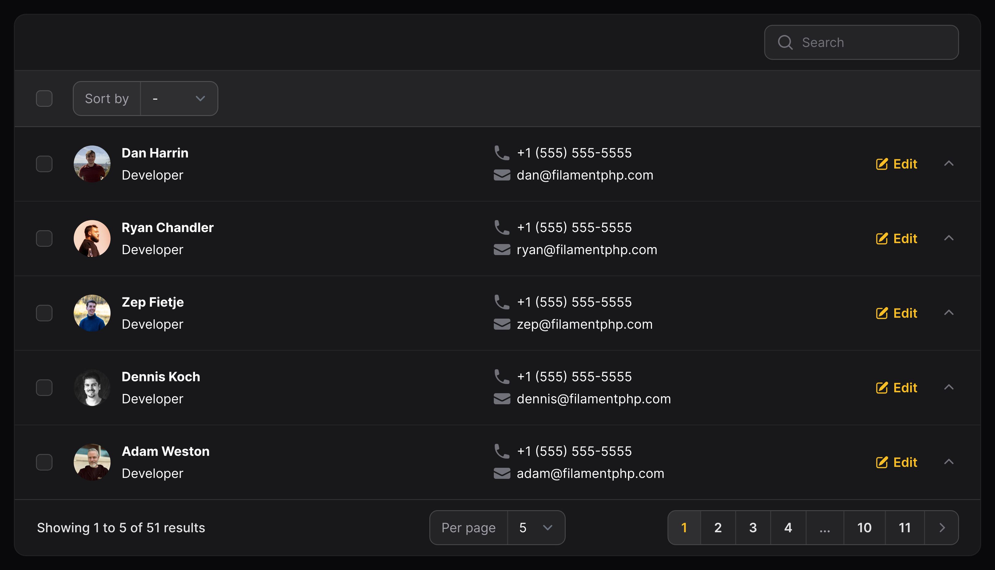
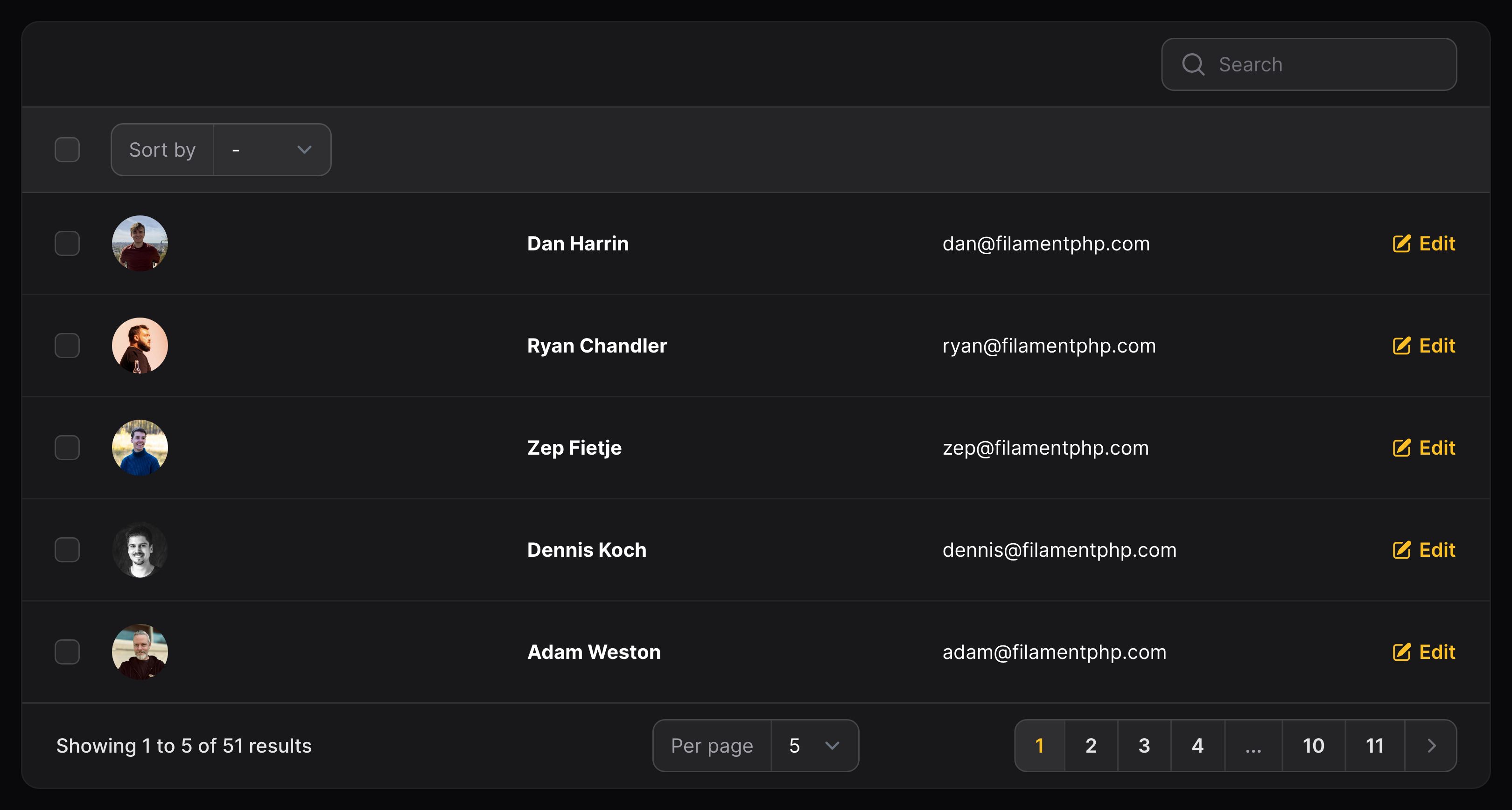
Let's introduce a component - Split:
use Filament\Support\Enums\FontWeight;use Filament\Tables\Columns\Layout\Split;use Filament\Tables\Columns\TextColumn; Split::make([ ImageColumn::make('avatar') ->circular(), TextColumn::make('name') ->weight(FontWeight::Bold) ->searchable() ->sortable(), TextColumn::make('email'),])

A Split component is used to wrap around columns, and allow them to stack on mobile.
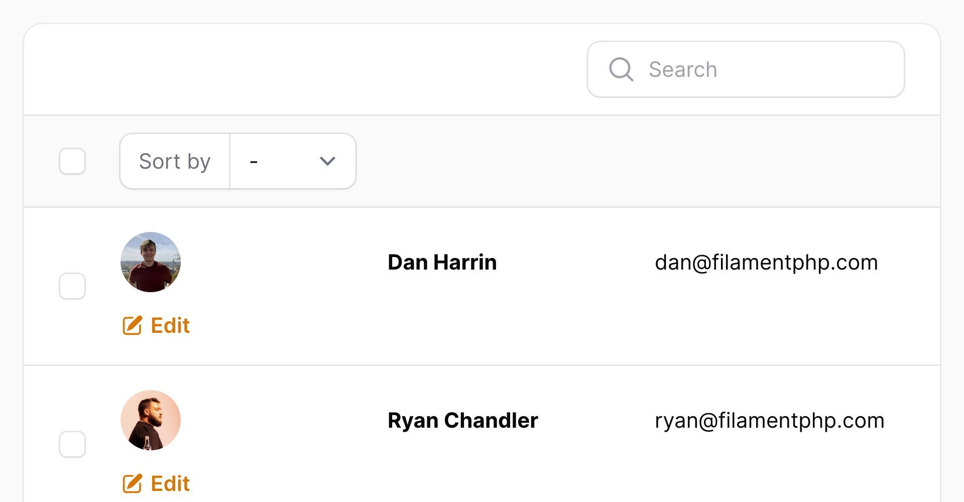
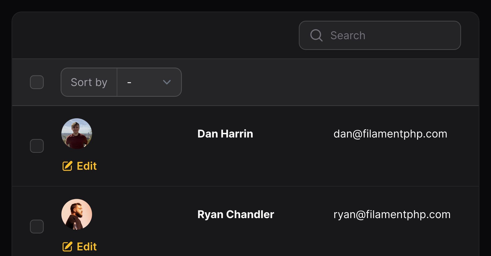
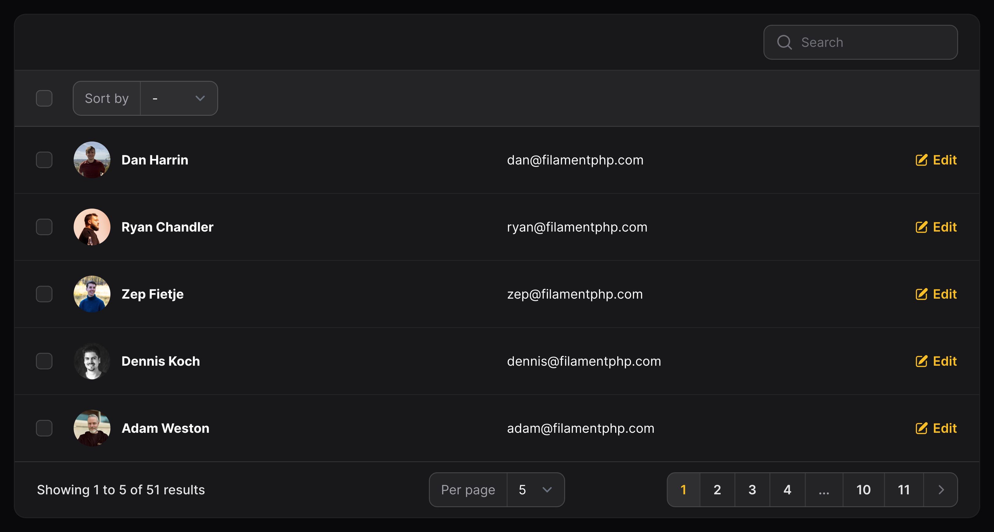
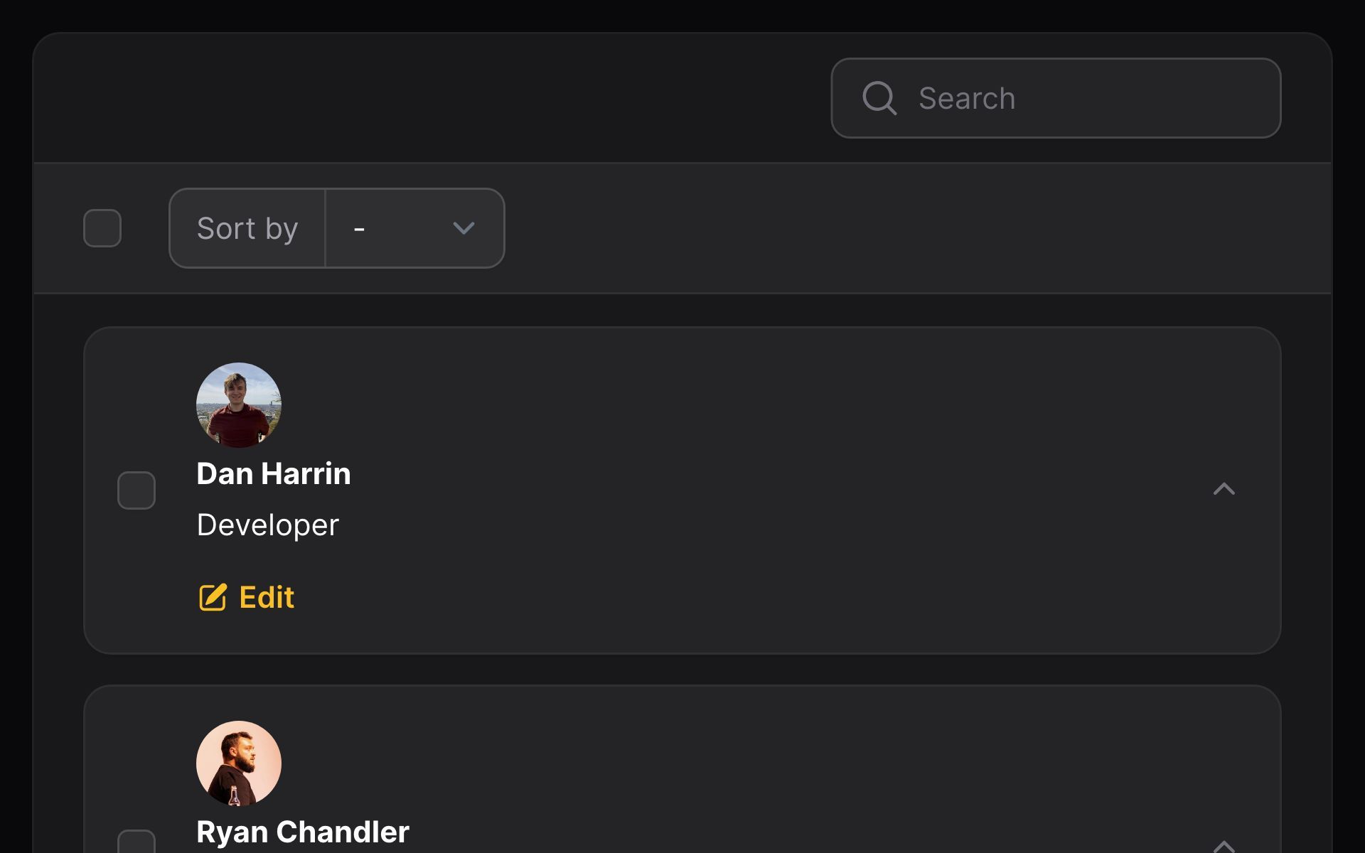
By default, columns within a split will appear aside each other all the time. However, you may choose a responsive breakpoint where this behaviour starts from(). Before this point, the columns will stack on top of each other:
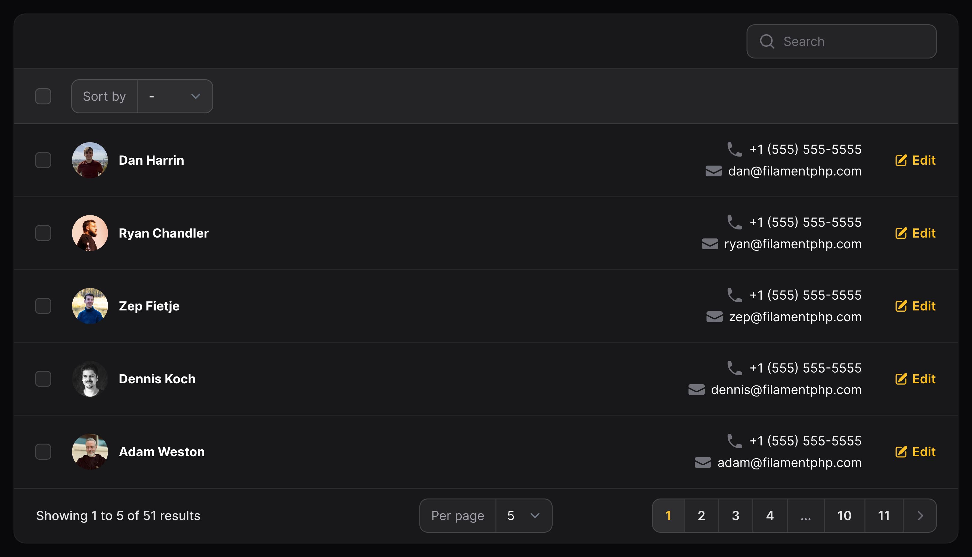
use Filament\Support\Enums\FontWeight;use Filament\Tables\Columns\Layout\Split;use Filament\Tables\Columns\ImageColumn;use Filament\Tables\Columns\TextColumn; Split::make([ ImageColumn::make('avatar') ->circular(), TextColumn::make('name') ->weight(FontWeight::Bold) ->searchable() ->sortable(), TextColumn::make('email'),])->from('md')In this example, the columns will only appear horizontally aside each other from md breakpoint devices onwards:


Preventing a column from creating whitespace
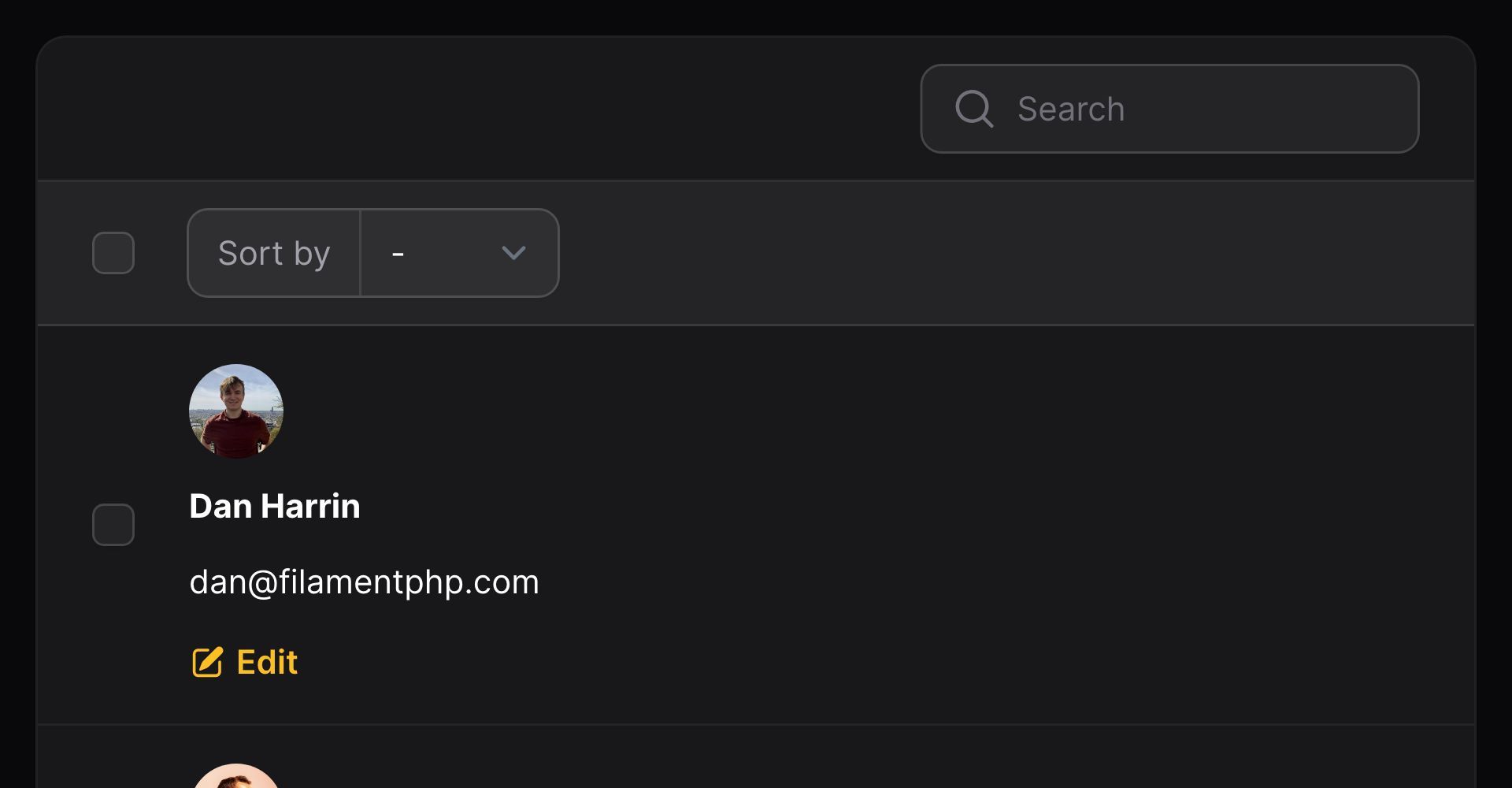
Splits, like table columns, will automatically adjust their whitespace to ensure that each column has proportionate separation. You can prevent this from happening, using grow(false). In this example, we will make sure that the avatar image will sit tightly against the name column:
use Filament\Support\Enums\FontWeight;use Filament\Tables\Columns\Layout\Split;use Filament\Tables\Columns\ImageColumn;use Filament\Tables\Columns\TextColumn; Split::make([ ImageColumn::make('avatar') ->circular() ->grow(false), TextColumn::make('name') ->weight(FontWeight::Bold) ->searchable() ->sortable(), TextColumn::make('email'),])The other columns which are allowed to grow() will adjust to consume the newly-freed space:


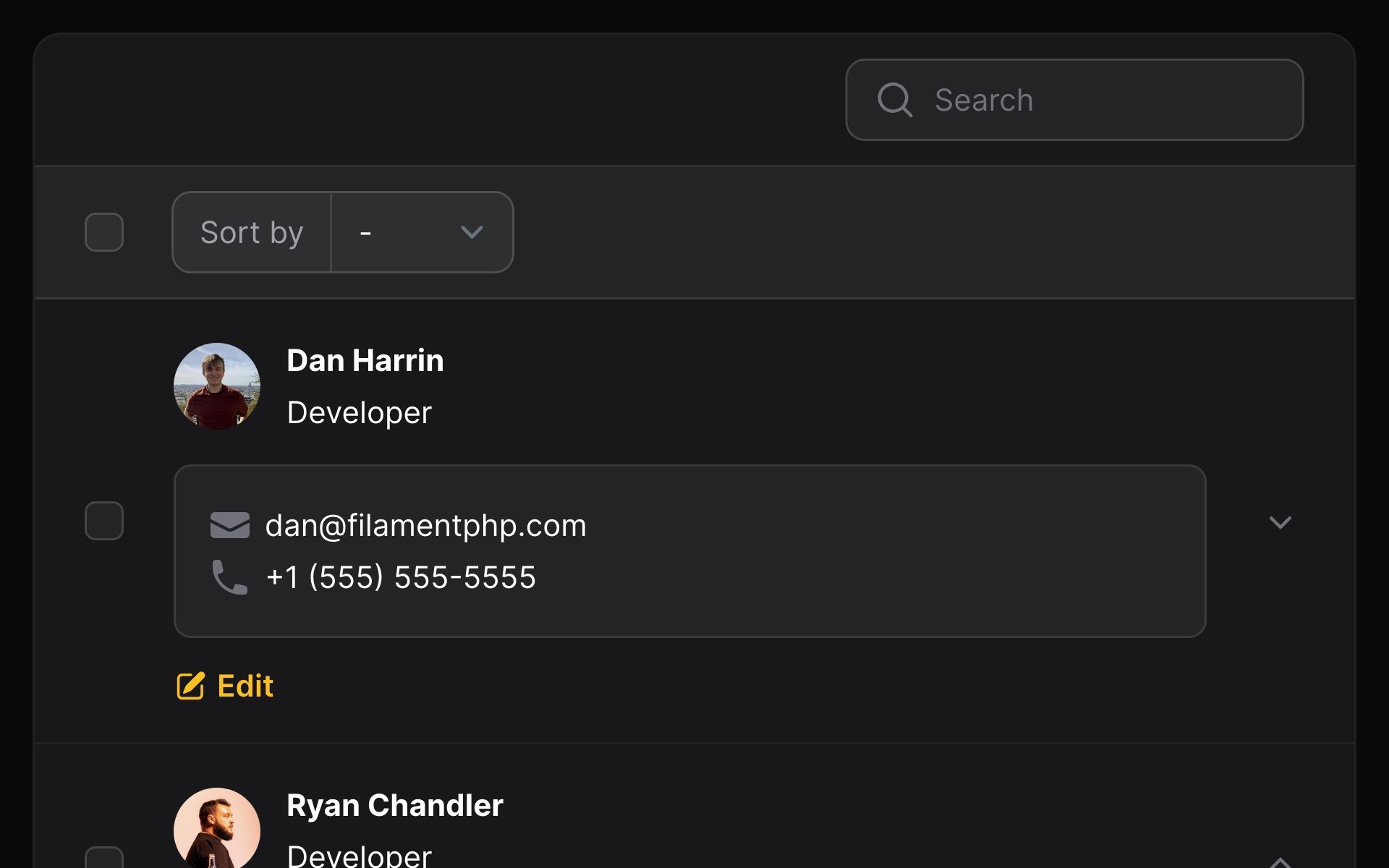
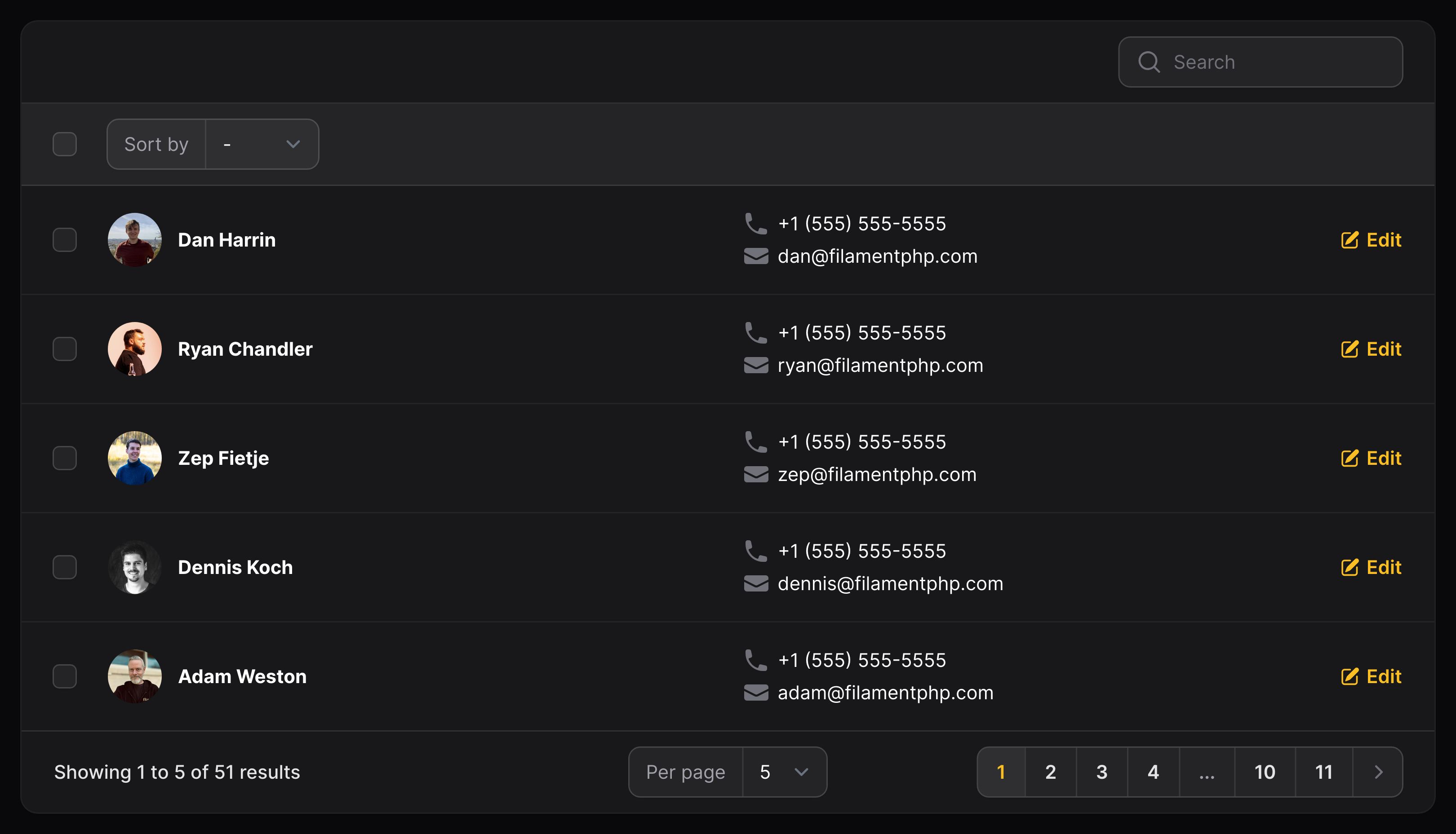
Stacking within a split
Inside a split, you may stack multiple columns on top of each other vertically. This allows you to display more data inside fewer columns on desktop:
use Filament\Support\Enums\FontWeight;use Filament\Tables\Columns\Layout\Split;use Filament\Tables\Columns\Layout\Stack;use Filament\Tables\Columns\ImageColumn;use Filament\Tables\Columns\TextColumn; Split::make([ ImageColumn::make('avatar') ->circular(), TextColumn::make('name') ->weight(FontWeight::Bold) ->searchable() ->sortable(), Stack::make([ TextColumn::make('phone') ->icon('heroicon-m-phone'), TextColumn::make('email') ->icon('heroicon-m-envelope'), ]),])


Hiding a stack on mobile
Similar to individual columns, you may choose to hide a stack based on the responsive breakpoint of the browser. To do this, you may use a visibleFrom() method:
use Filament\Support\Enums\FontWeight;use Filament\Tables\Columns\Layout\Split;use Filament\Tables\Columns\Layout\Stack;use Filament\Tables\Columns\ImageColumn;use Filament\Tables\Columns\TextColumn; Split::make([ ImageColumn::make('avatar') ->circular(), TextColumn::make('name') ->weight(FontWeight::Bold) ->searchable() ->sortable(), Stack::make([ TextColumn::make('phone') ->icon('heroicon-m-phone'), TextColumn::make('email') ->icon('heroicon-m-envelope'), ])->visibleFrom('md'),])

Aligning stacked content
By default, columns within a stack are aligned to the start. You may choose to align columns within a stack to the Alignment::Center or Alignment::End:
use Filament\Support\Enums\Alignment;use Filament\Support\Enums\FontWeight;use Filament\Tables\Columns\Layout\Split;use Filament\Tables\Columns\Layout\Stack;use Filament\Tables\Columns\ImageColumn;use Filament\Tables\Columns\TextColumn; Split::make([ ImageColumn::make('avatar') ->circular(), TextColumn::make('name') ->weight(FontWeight::Bold) ->searchable() ->sortable(), Stack::make([ TextColumn::make('phone') ->icon('heroicon-m-phone') ->grow(false), TextColumn::make('email') ->icon('heroicon-m-envelope') ->grow(false), ]) ->alignment(Alignment::End) ->visibleFrom('md'),])Ensure that the columns within the stack have grow(false) set, otherwise they will stretch to fill the entire width of the stack and follow their own alignment configuration instead of the stack's.

Spacing stacked content
By default, stacked content has no vertical padding between columns. To add some, you may use the space() method, which accepts either 1, 2, or 3, corresponding to Tailwind's spacing scale:
use Filament\Tables\Columns\Layout\Stack;use Filament\Tables\Columns\TextColumn; Stack::make([ TextColumn::make('phone') ->icon('heroicon-m-phone'), TextColumn::make('email') ->icon('heroicon-m-envelope'),])->space(1)Controlling column width using a grid
Sometimes, using a Split creates inconsistent widths when columns contain lots of content. This is because it's powered by Flexbox internally and each row individually controls how much space is allocated to content.
Instead, you may use a Grid layout, which uses CSS Grid Layout to allow you to control column widths:
use Filament\Tables\Columns\Layout\Grid;use Filament\Tables\Columns\TextColumn; Grid::make([ 'lg' => 2,]) ->schema([ TextColumn::make('phone') ->icon('heroicon-m-phone'), TextColumn::make('email') ->icon('heroicon-m-envelope'), ])These columns will always consume equal width within the grid, from the lg breakpoint.
You may choose to customize the number of columns within the grid at other breakpoints:
use Filament\Tables\Columns\Layout\Grid;use Filament\Tables\Columns\Layout\Stack;use Filament\Tables\Columns\TextColumn; Grid::make([ 'lg' => 2, '2xl' => 4,]) ->schema([ Stack::make([ TextColumn::make('name'), TextColumn::make('job'), ]), TextColumn::make('phone') ->icon('heroicon-m-phone'), TextColumn::make('email') ->icon('heroicon-m-envelope'), ])And you can even control how many grid columns will be consumed by each component at each breakpoint:
use Filament\Tables\Columns\Layout\Grid;use Filament\Tables\Columns\Layout\Stack;use Filament\Tables\Columns\TextColumn; Grid::make([ 'lg' => 2, '2xl' => 5,]) ->schema([ Stack::make([ TextColumn::make('name'), TextColumn::make('job'), ])->columnSpan([ 'lg' => 'full', '2xl' => 2, ]), TextColumn::make('phone') ->icon('heroicon-m-phone') ->columnSpan([ '2xl' => 2, ]), TextColumn::make('email') ->icon('heroicon-m-envelope'), ])Collapsible content
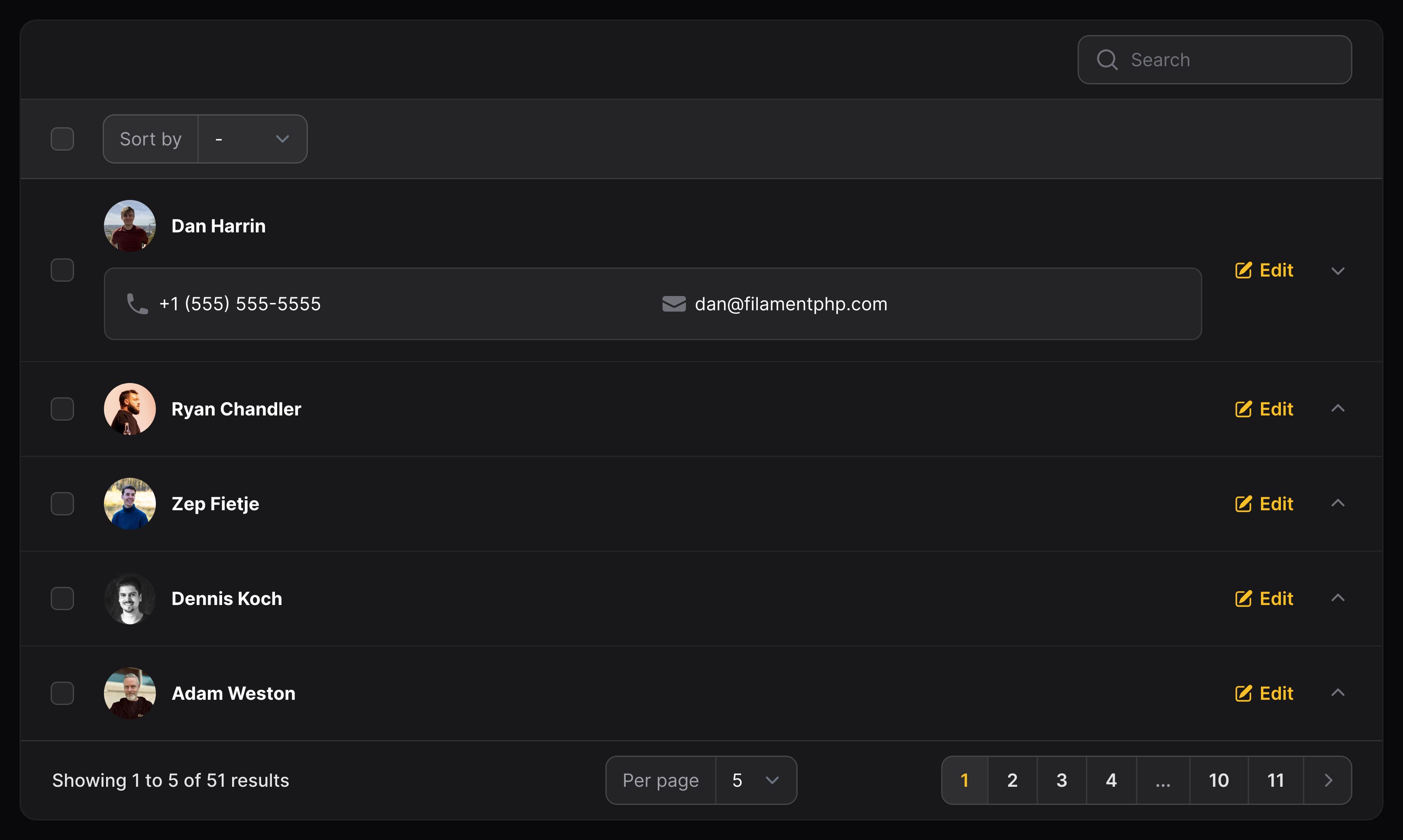
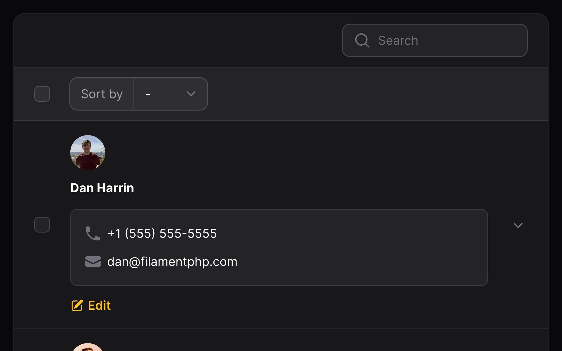
When you're using a column layout like split or stack, then you can also add collapsible content. This is very useful for when you don't want to display all data in the table at once, but still want it to be accessible to the user if they need to access it, without navigating away.
Split and stack components can be made collapsible(), but there is also a dedicated Panel component that provides a pre-styled background color and border radius, to separate the collapsible content from the rest:
use Filament\Support\Enums\FontWeight;use Filament\Tables\Columns\Layout\Panel;use Filament\Tables\Columns\Layout\Split;use Filament\Tables\Columns\Layout\Stack;use Filament\Tables\Columns\ImageColumn;use Filament\Tables\Columns\TextColumn; [ Split::make([ ImageColumn::make('avatar') ->circular(), TextColumn::make('name') ->weight(FontWeight::Bold) ->searchable() ->sortable(), ]), Panel::make([ Stack::make([ TextColumn::make('phone') ->icon('heroicon-m-phone'), TextColumn::make('email') ->icon('heroicon-m-envelope'), ]), ])->collapsible(),]You can expand a panel by default using the collapsed(false) method:
use Filament\Tables\Columns\Layout\Panel;use Filament\Tables\Columns\Layout\Split;use Filament\Tables\Columns\TextColumn; Panel::make([ Split::make([ TextColumn::make('phone') ->icon('heroicon-m-phone'), TextColumn::make('email') ->icon('heroicon-m-envelope'), ])->from('md'),])->collapsed(false)

Arranging records into a grid
Sometimes, you may find that your data fits into a grid format better than a list. Filament can handle that too!
Simply use the $table->contentGrid() method:
use Filament\Tables\Columns\Layout\Stack;use Filament\Tables\Table; public function table(Table $table): Table{ return $table ->columns([ Stack::make([ // Columns ]), ]) ->contentGrid([ 'md' => 2, 'xl' => 3, ]);}In this example, the rows will be displayed in a grid:
- On mobile, they will be displayed in 1 column only.
- From the
mdbreakpoint, they will be displayed in 2 columns. - From the
xlbreakpoint onwards, they will be displayed in 3 columns.
These settings are fully customizable, any breakpoint from sm to 2xl can contain 1 to 12 columns.


Custom HTML
You may add custom HTML to your table using a View component. It can even be collapsible():
use Filament\Support\Enums\FontWeight;use Filament\Tables\Columns\Layout\Split;use Filament\Tables\Columns\Layout\View;use Filament\Tables\Columns\ImageColumn;use Filament\Tables\Columns\TextColumn; [ Split::make([ ImageColumn::make('avatar') ->circular(), TextColumn::make('name') ->weight(FontWeight::Bold) ->searchable() ->sortable(), ]), View::make('users.table.collapsible-row-content') ->collapsible(),]Now, create a /resources/views/users/table/collapsible-row-content.blade.php file, and add in your HTML. You can access the table record using $getRecord():
<p class="px-4 py-3 bg-gray-100 rounded-lg"> <span class="font-medium"> Email address: </span> <span> {{ $getRecord()->email }} </span></p>Embedding other components
You could even pass in columns or other layout components to the components() method:
use Filament\Support\Enums\FontWeight;use Filament\Tables\Columns\Layout\Split;use Filament\Tables\Columns\Layout\View;use Filament\Tables\Columns\ImageColumn;use Filament\Tables\Columns\TextColumn; [ Split::make([ ImageColumn::make('avatar') ->circular(), TextColumn::make('name') ->weight(FontWeight::Bold) ->searchable() ->sortable(), ]), View::make('users.table.collapsible-row-content') ->components([ TextColumn::make('email') ->icon('heroicon-m-envelope'), ]) ->collapsible(),]Now, render the components in the Blade file:
<div class="px-4 py-3 bg-gray-100 rounded-lg"> <x-filament-tables::columns.layout :components="$getComponents()" :record="$getRecord()" :record-key="$recordKey" /></div>Still need help? Join our Discord community or open a GitHub discussion