
Form Builder - Fields
Builder
Overview
Similar to a repeater, the builder component allows you to output a JSON array of repeated form components. Unlike the repeater, which only defines one form schema to repeat, the builder allows you to define different schema "blocks", which you can repeat in any order. This makes it useful for building more advanced array structures.
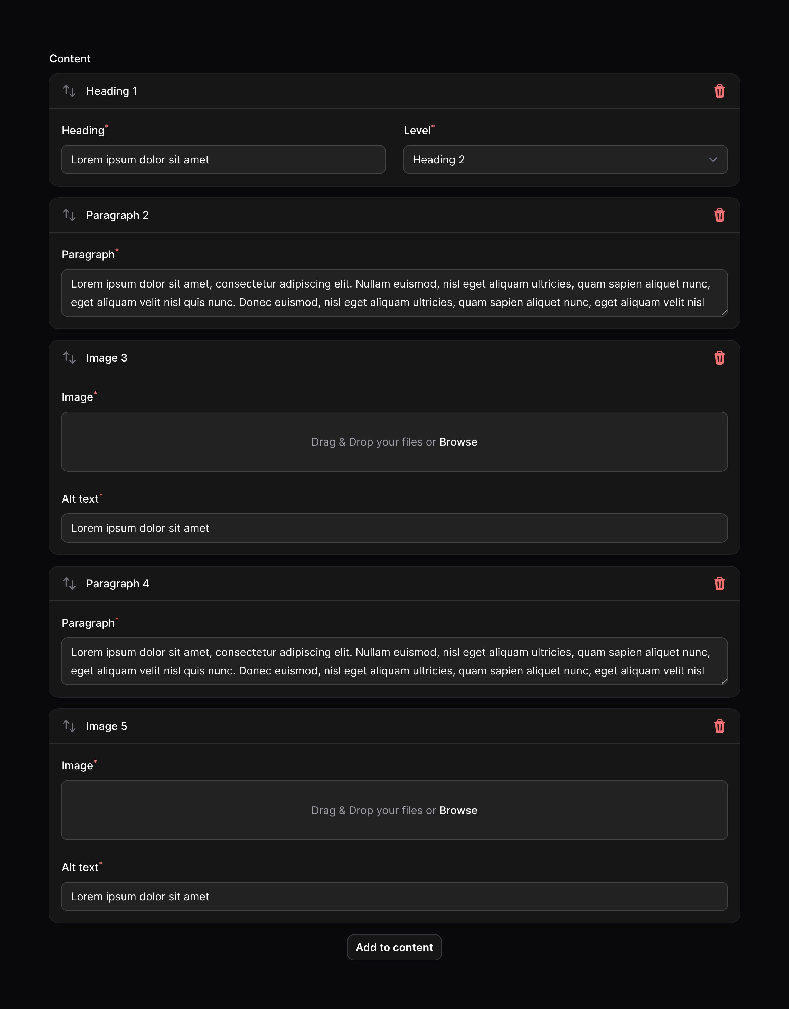
The primary use of the builder component is to build web page content using predefined blocks. This could be content for a marketing website, or maybe even fields in an online form. The example below defines multiple blocks for different elements in the page content. On the frontend of your website, you could loop through each block in the JSON and format it how you wish.
use Filament\Forms\Components\Builder;use Filament\Forms\Components\FileUpload;use Filament\Forms\Components\Select;use Filament\Forms\Components\Textarea;use Filament\Forms\Components\TextInput; Builder::make('content') ->blocks([ Builder\Block::make('heading') ->schema([ TextInput::make('content') ->label('Heading') ->required(), Select::make('level') ->options([ 'h1' => 'Heading 1', 'h2' => 'Heading 2', 'h3' => 'Heading 3', 'h4' => 'Heading 4', 'h5' => 'Heading 5', 'h6' => 'Heading 6', ]) ->required(), ]) ->columns(2), Builder\Block::make('paragraph') ->schema([ Textarea::make('content') ->label('Paragraph') ->required(), ]), Builder\Block::make('image') ->schema([ FileUpload::make('url') ->label('Image') ->image() ->required(), TextInput::make('alt') ->label('Alt text') ->required(), ]), ])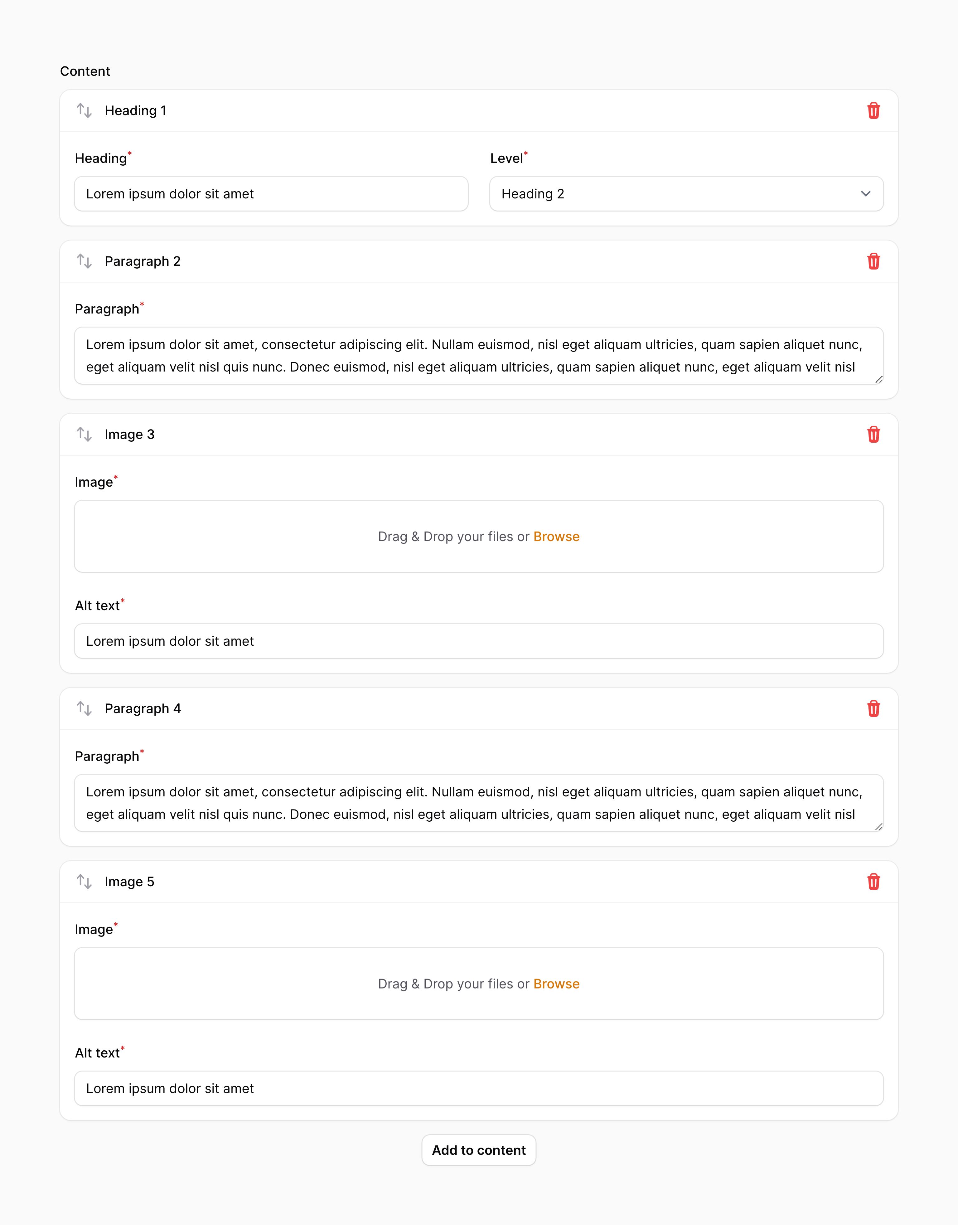
We recommend that you store builder data with a JSON column in your database. Additionally, if you're using Eloquent, make sure that column has an array cast.
As evident in the above example, blocks can be defined within the blocks() method of the component. Blocks are Builder\Block objects, and require a unique name, and a component schema:
use Filament\Forms\Components\Builder;use Filament\Forms\Components\TextInput; Builder::make('content') ->blocks([ Builder\Block::make('heading') ->schema([ TextInput::make('content')->required(), // ... ]), // ... ])Setting a block's label
By default, the label of the block will be automatically determined based on its name. To override the block's label, you may use the label() method. Customizing the label in this way is useful if you wish to use a translation string for localization:
use Filament\Forms\Components\Builder; Builder\Block::make('heading') ->label(__('blocks.heading'))Labelling builder items based on their content
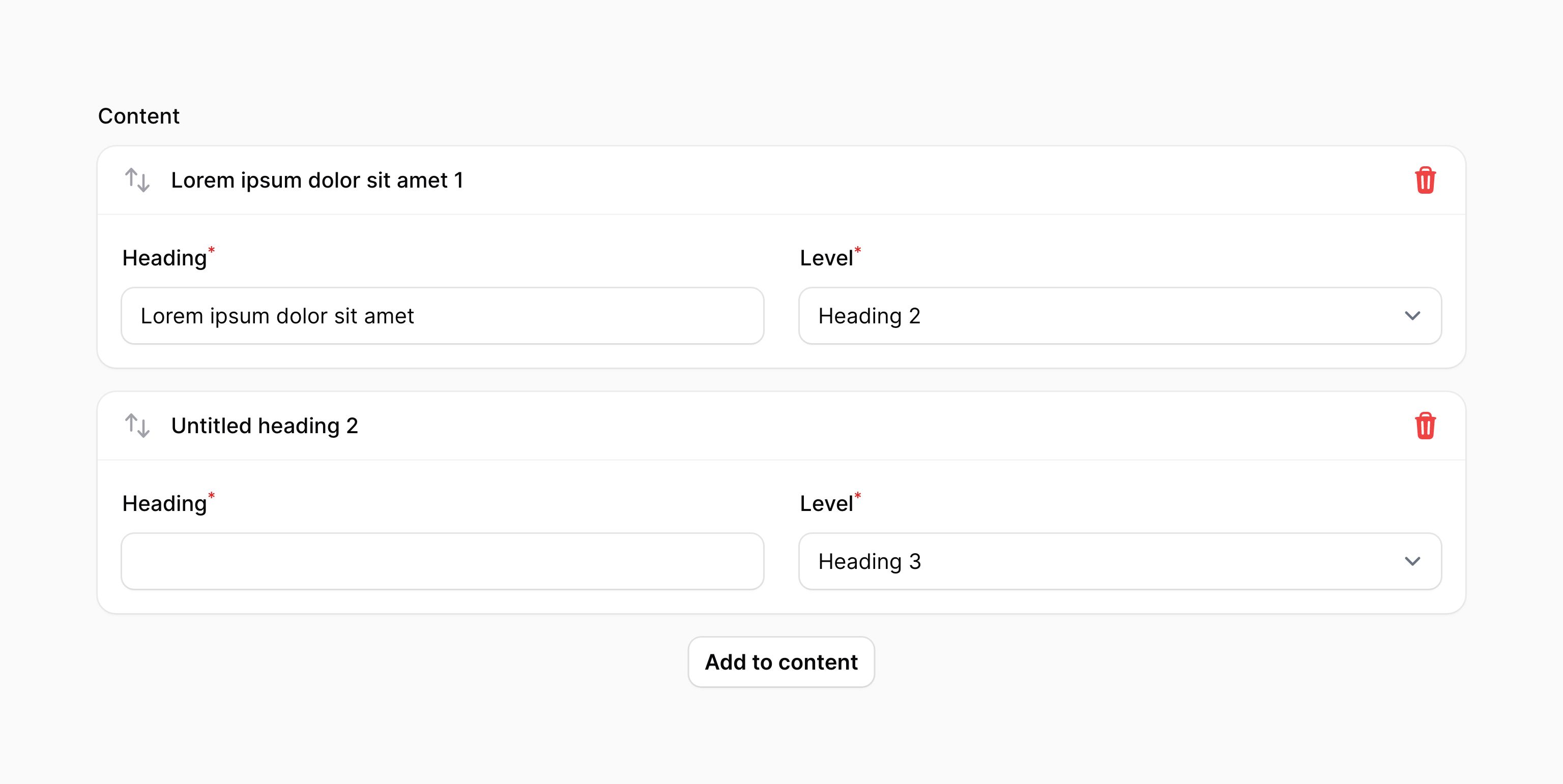
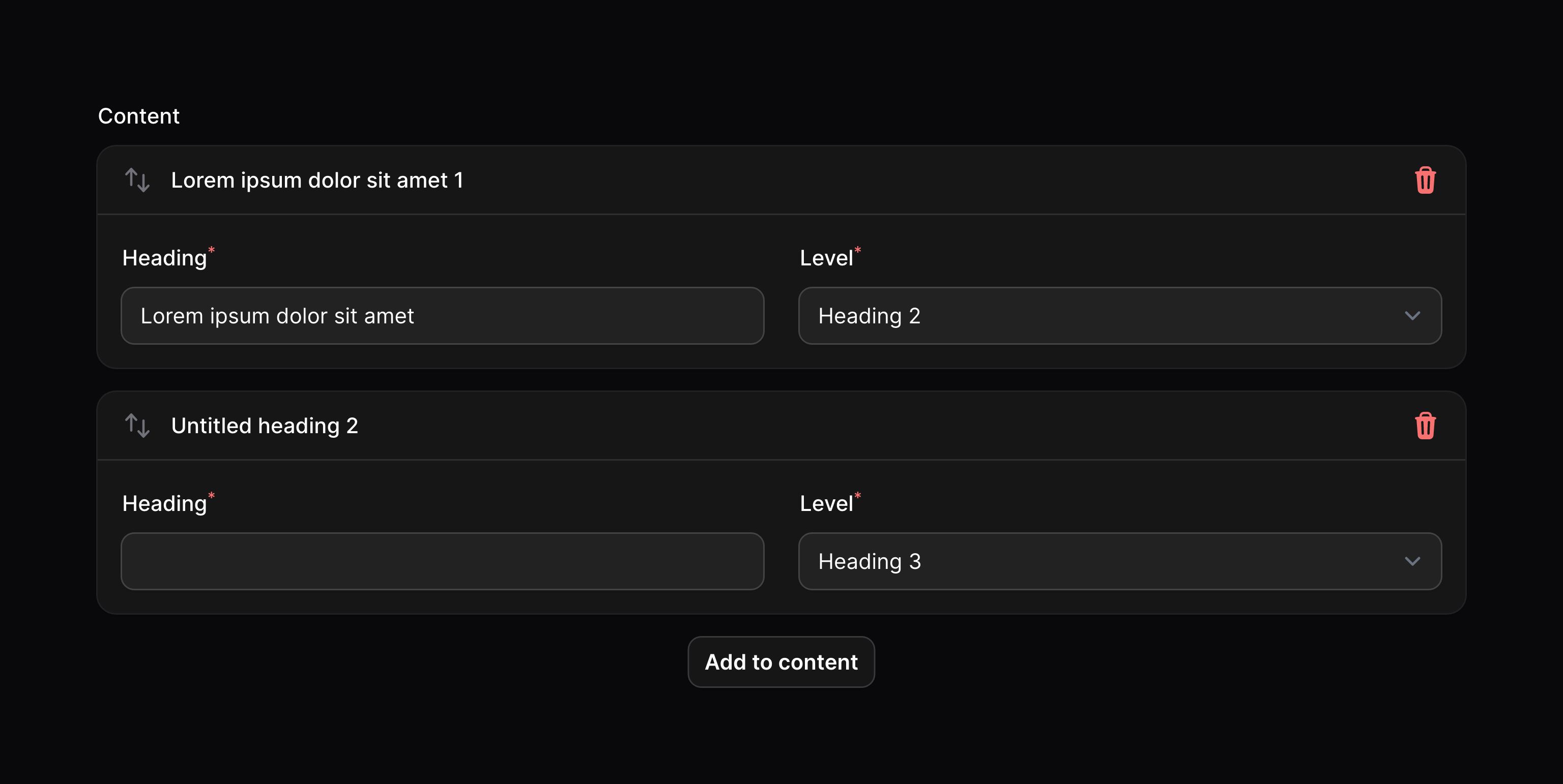
You may add a label for a builder item using the same label() method. This method accepts a closure that receives the item's data in a $state variable. If $state is null, you should return the block label that should be displayed in the block picker. Otherwise, you should return a string to be used as the item label:
use Filament\Forms\Components\Builder;use Filament\Forms\Components\TextInput; Builder\Block::make('heading') ->schema([ TextInput::make('content') ->live(onBlur: true) ->required(), // ... ]) ->label(function (?array $state): string { if ($state === null) { return 'Heading'; } return $state['content'] ?? 'Untitled heading'; })Any fields that you use from $state should be live() if you wish to see the item label update live as you use the form.
Numbering builder items
By default, items in the builder have a number next to their label. You may disable this using the blockNumbers(false) method:
use Filament\Forms\Components\Builder; Builder::make('content') ->blocks([ // ... ]) ->blockNumbers(false)Setting a block's icon
Blocks may also have an icon, which is displayed next to the label. You can add an icon by passing its name to the icon() method:
use Filament\Forms\Components\Builder; Builder\Block::make('paragraph') ->icon('heroicon-m-bars-3-bottom-left')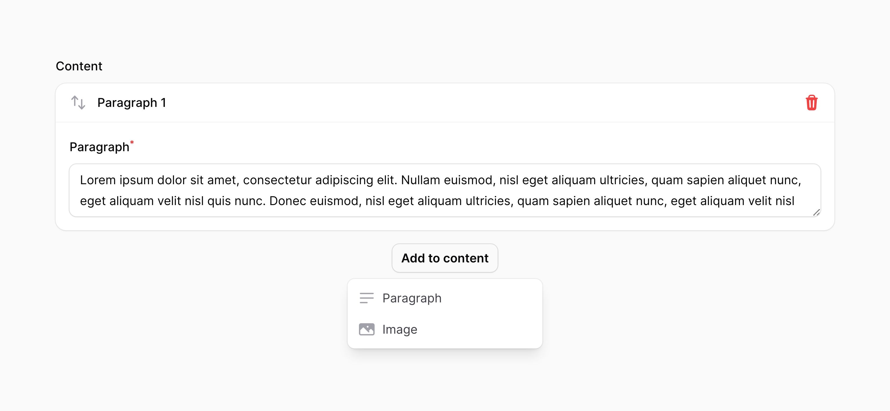
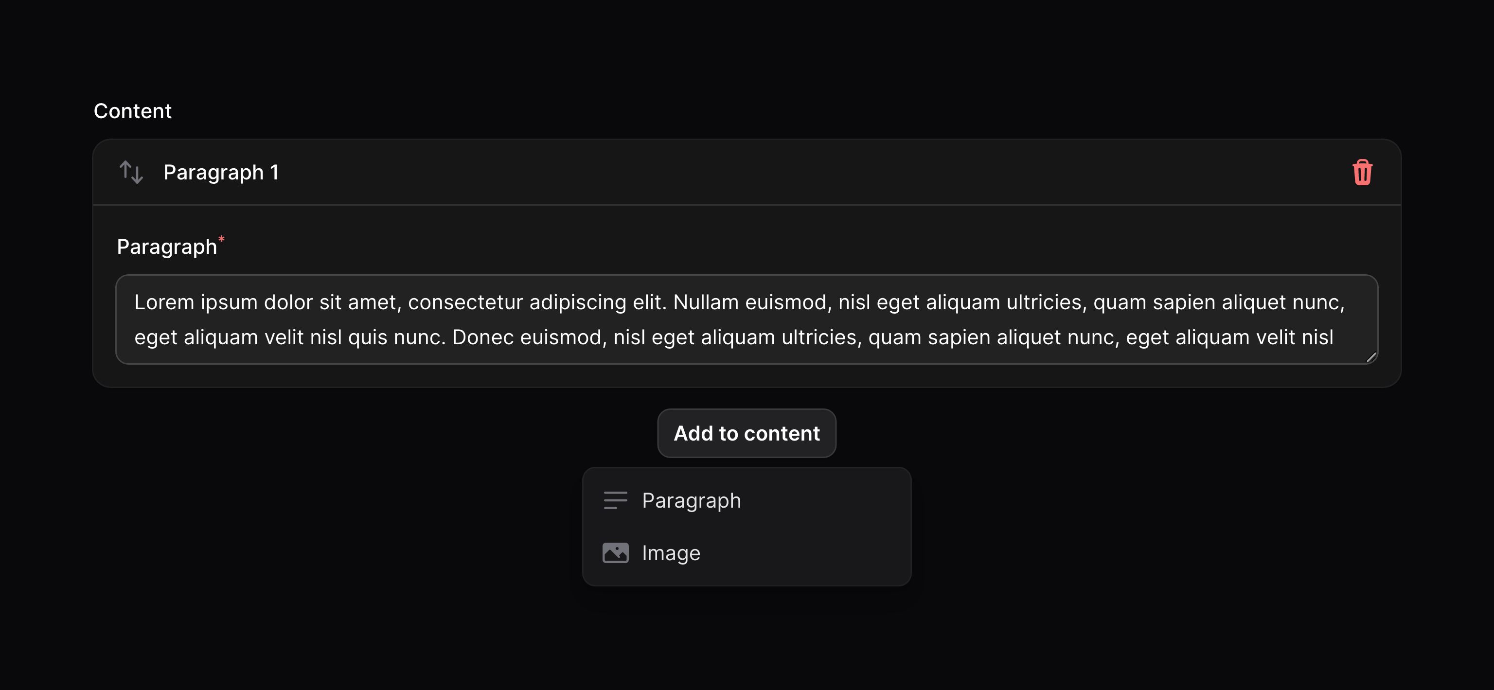
Adding items
An action button is displayed below the builder to allow the user to add a new item.
Setting the add action button's label
You may set a label to customize the text that should be displayed in the button for adding a builder item, using the addActionLabel() method:
use Filament\Forms\Components\Builder; Builder::make('content') ->blocks([ // ... ]) ->addActionLabel('Add a new block')Preventing the user from adding items
You may prevent the user from adding items to the builder using the addable(false) method:
use Filament\Forms\Components\Builder; Builder::make('content') ->blocks([ // ... ]) ->addable(false)Deleting items
An action button is displayed on each item to allow the user to delete it.
Preventing the user from deleting items
You may prevent the user from deleting items from the builder using the deletable(false) method:
use Filament\Forms\Components\Builder; Builder::make('content') ->blocks([ // ... ]) ->deletable(false)Reordering items
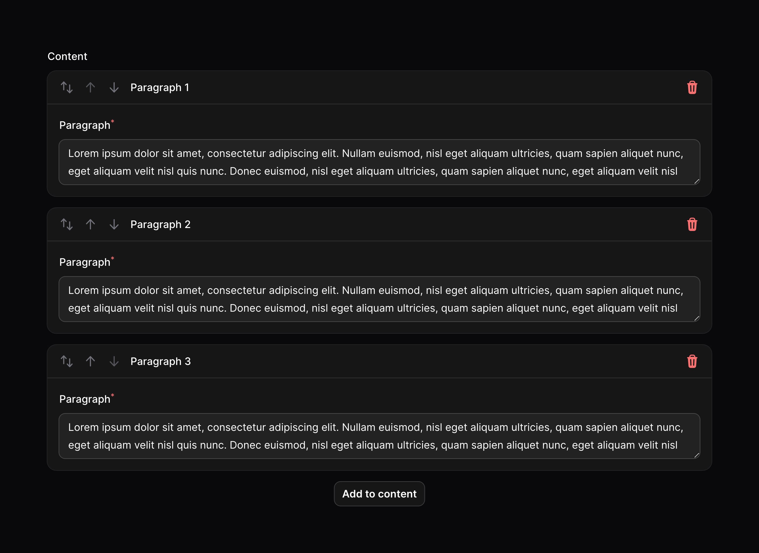
A button is displayed on each item to allow the user to drag and drop to reorder it in the list.
Preventing the user from reordering items
You may prevent the user from reordering items from the builder using the reorderable(false) method:
use Filament\Forms\Components\Builder; Builder::make('content') ->blocks([ // ... ]) ->reorderable(false)Reordering items with buttons
You may use the reorderableWithButtons() method to enable reordering items with buttons to move the item up and down:
use Filament\Forms\Components\Builder; Builder::make('content') ->blocks([ // ... ]) ->reorderableWithButtons()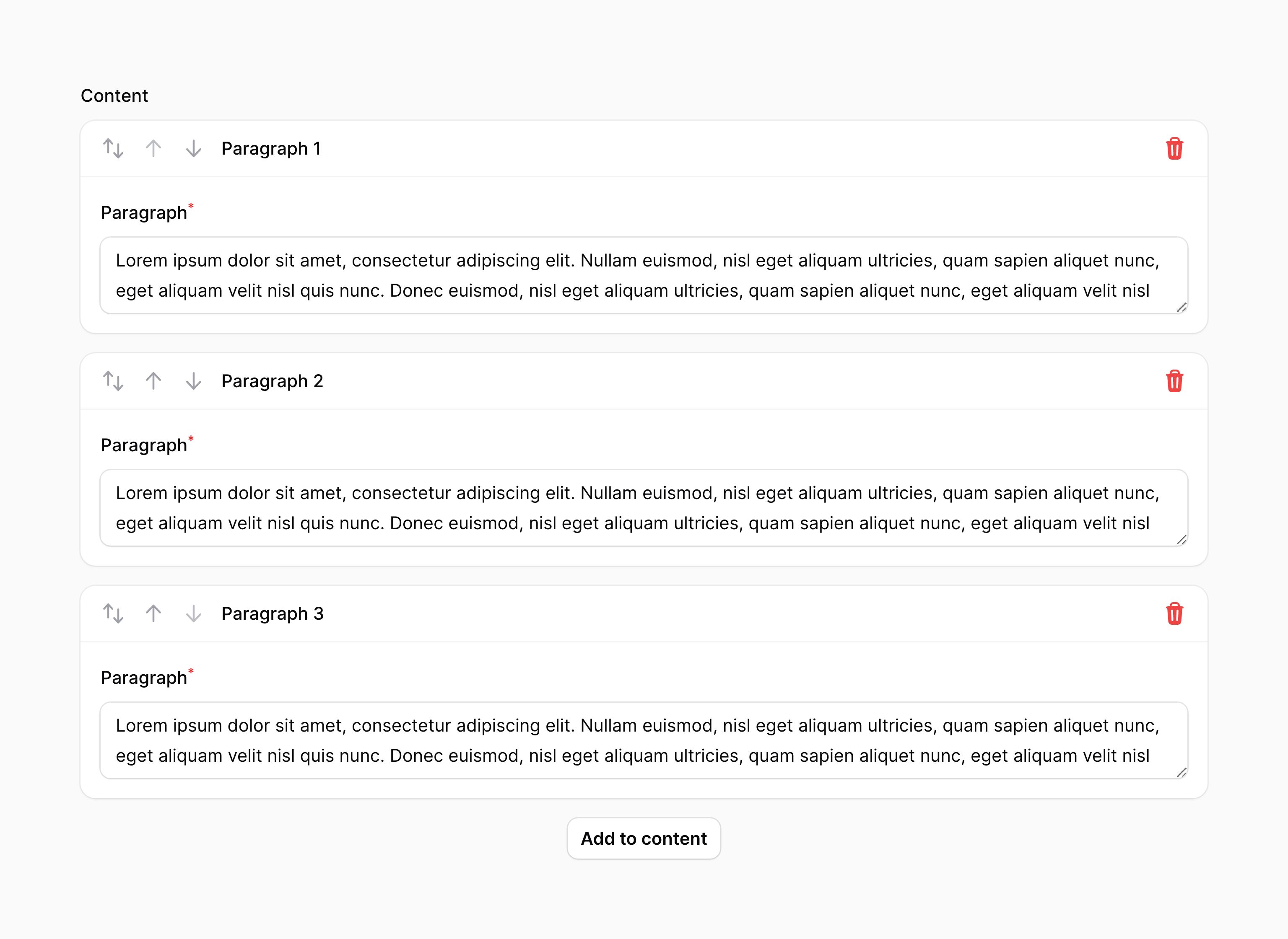
Preventing reordering with drag and drop
You may use the reorderableWithDragAndDrop(false) method to prevent items from being ordered with drag and drop:
use Filament\Forms\Components\Builder; Builder::make('content') ->blocks([ // ... ]) ->reorderableWithDragAndDrop(false)Collapsing items
The builder may be collapsible() to optionally hide content in long forms:
use Filament\Forms\Components\Builder; Builder::make('content') ->blocks([ // ... ]) ->collapsible()You may also collapse all items by default:
use Filament\Forms\Components\Builder; Builder::make('content') ->blocks([ // ... ]) ->collapsed()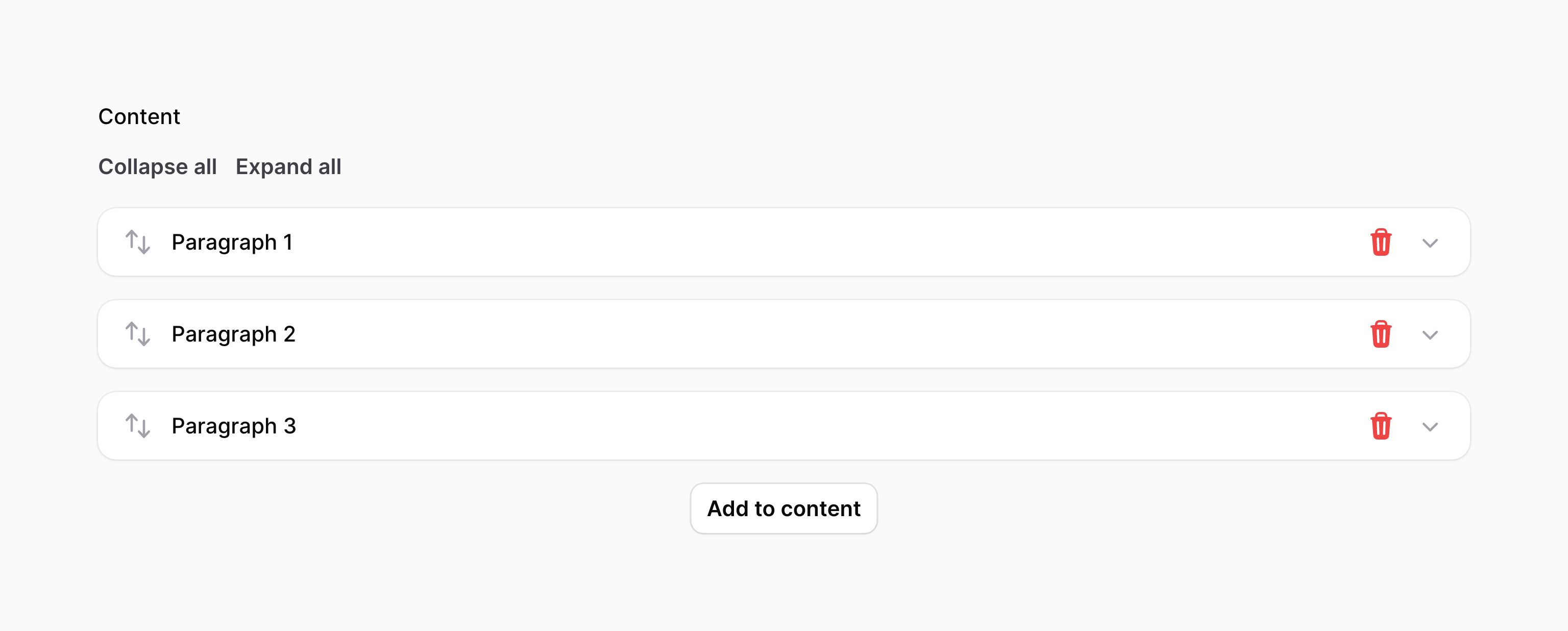
Cloning items
You may allow builder items to be duplicated using the cloneable() method:
use Filament\Forms\Components\Builder; Builder::make('content') ->blocks([ // ... ]) ->cloneable()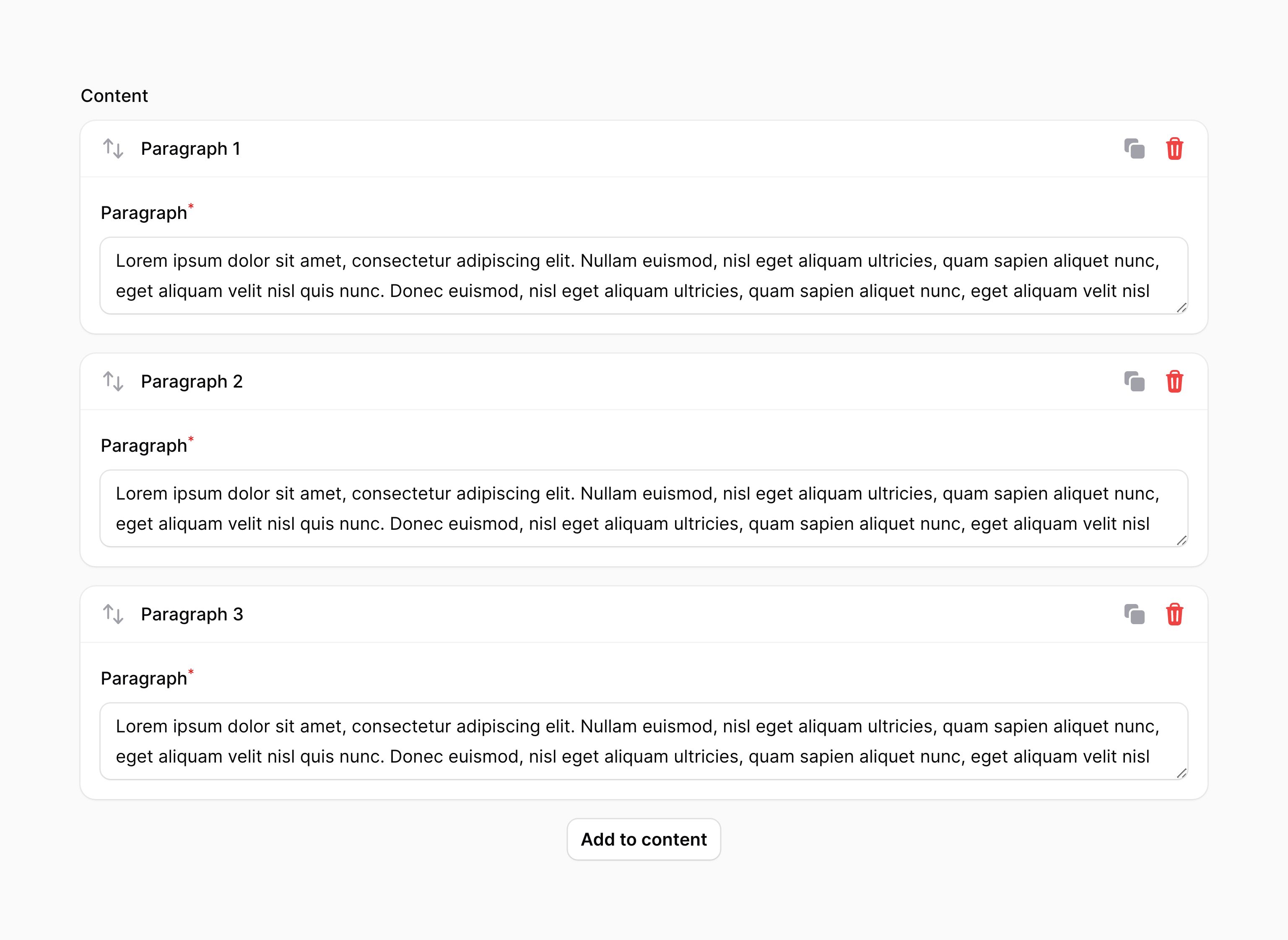
Customizing the block picker
Changing the number of columns in the block picker
The block picker has only 1 column. You may customize it by passing a number of columns to blockPickerColumns():
use Filament\Forms\Components\Builder; Builder::make() ->blockPickerColumns(2) ->blocks([ // ... ])This method can be used in a couple of different ways:
- You can pass an integer like
blockPickerColumns(2). This integer is the number of columns used on thelgbreakpoint and higher. All smaller devices will have just 1 column. - You can pass an array, where the key is the breakpoint and the value is the number of columns. For example,
blockPickerColumns(['md' => 2, 'xl' => 4])will create a 2 column layout on medium devices, and a 4 column layout on extra large devices. The default breakpoint for smaller devices uses 1 column, unless you use adefaultarray key.
Breakpoints (sm, md, lg, xl, 2xl) are defined by Tailwind, and can be found in the Tailwind documentation.
Increasing the width of the block picker
When you increase the number of columns, the width of the dropdown should increase incrementally to handle the additional columns. If you'd like more control, you can manually set a maximum width for the dropdown using the blockPickerWidth() method. Options correspond to Tailwind's max-width scale. The options are xs, sm, md, lg, xl, 2xl, 3xl, 4xl, 5xl, 6xl, 7xl:
use Filament\Forms\Components\Builder; Builder::make() ->blockPickerColumns(3) ->blockPickerWidth('2xl') ->blocks([ // ... ])Limiting the number of times a block can be used
By default, each block can be used in the builder an unlimited number of times. You may limit this using the maxItems() method on a block:
use Filament\Forms\Components\Builder; Builder\Block::make('heading') ->schema([ // ... ]) ->maxItems(1)Builder validation
As well as all rules listed on the validation page, there are additional rules that are specific to builders.
Number of items validation
You can validate the minimum and maximum number of items that you can have in a builder by setting the minItems() and maxItems() methods:
use Filament\Forms\Components\Builder; Builder::make('content') ->blocks([ // ... ]) ->minItems(1) ->maxItems(5)Customizing the builder item actions
This field uses action objects for easy customization of buttons within it. You can customize these buttons by passing a function to an action registration method. The function has access to the $action object, which you can use to customize it. The following methods are available to customize the actions:
addAction()addBetweenAction()cloneAction()collapseAction()collapseAllAction()deleteAction()expandAction()expandAllAction()moveDownAction()moveUpAction()reorderAction()
Here is an example of how you might customize an action:
use Filament\Forms\Components\Actions\Action;use Filament\Forms\Components\Builder; Builder::make('content') ->blocks([ // ... ]) ->collapseAllAction( fn (Action $action) => $action->label('Collapse all content'), )Confirming builder actions with a modal
You can confirm actions with a modal by using the requiresConfirmation() method on the action object. You may use any modal customization method to change its content and behaviour:
use Filament\Forms\Components\Actions\Action;use Filament\Forms\Components\Builder; Builder::make('content') ->blocks([ // ... ]) ->deleteAction( fn (Action $action) => $action->requiresConfirmation(), )The
addAction(),addBetweenAction(),collapseAction(),collapseAllAction(),expandAction(),expandAllAction()andreorderAction()methods do not support confirmation modals, as clicking their buttons does not make the network request that is required to show the modal.
Adding extra item actions to a builder
You may add new action buttons to the header of each builder item by passing Action objects into extraItemActions():
use Filament\Forms\Components\Actions\Action;use Filament\Forms\Components\Builder;use Filament\Forms\Components\TextInput;use Illuminate\Support\Facades\Mail; Builder::make('content') ->blocks([ Builder\Block::make('contactDetails') ->schema([ TextInput::make('email') ->label('Email address') ->email() ->required(), // ... ]), // ... ]) ->extraItemActions([ Action::make('sendEmail') ->icon('heroicon-m-square-2-stack') ->action(function (array $arguments, Builder $component): void { $itemData = $component->getItemState($arguments['item']); Mail::to($itemData['email']) ->send( // ... ); }), ])In this example, $arguments['item'] gives you the ID of the current builder item. You can validate the data in that builder item using the getItemState() method on the builder component. This method returns the validated data for the item. If the item is not valid, it will cancel the action and show an error message for that item in the form.
If you want to get the raw data from the current item without validating it, you can use $component->getRawItemState($arguments['item']) instead.
If you want to manipulate the raw data for the entire builder, for example, to add, remove or modify items, you can use $component->getState() to get the data, and $component->state($state) to set it again:
use Illuminate\Support\Str; // Get the raw data for the entire builder$state = $component->getState(); // Add an item, with a random UUID as the key$state[Str::uuid()] = [ 'type' => 'contactDetails', 'data' => [ 'email' => auth()->user()->email, ],]; // Set the new data for the builder$component->state($state);Still need help? Join our Discord community or open a GitHub discussion