
Form Builder - Layout
Tabs
Overview
Some forms can be long and complex. You may want to use tabs to reduce the number of components that are visible at once:
use Filament\Forms\Components\Tabs; Tabs::make('Tabs') ->tabs([ Tabs\Tab::make('Tab 1') ->schema([ // ... ]), Tabs\Tab::make('Tab 2') ->schema([ // ... ]), Tabs\Tab::make('Tab 3') ->schema([ // ... ]), ])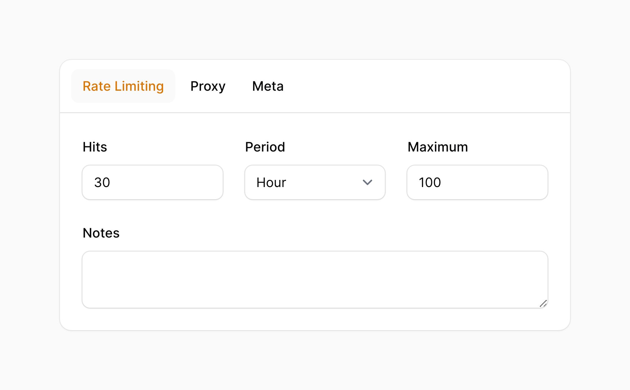
Setting the default active tab
The first tab will be open by default. You can change the default open tab using the activeTab() method:
use Filament\Forms\Components\Tabs; Tabs::make('Tabs') ->tabs([ Tabs\Tab::make('Tab 1') ->schema([ // ... ]), Tabs\Tab::make('Tab 2') ->schema([ // ... ]), Tabs\Tab::make('Tab 3') ->schema([ // ... ]), ]) ->activeTab(2)Setting a tab icon
Tabs may have an icon, which you can set using the icon() method:
use Filament\Forms\Components\Tabs; Tabs::make('Tabs') ->tabs([ Tabs\Tab::make('Notifications') ->icon('heroicon-m-bell') ->schema([ // ... ]), // ... ])
Setting the tab icon position
The icon of the tab may be positioned before or after the label using the iconPosition() method:
use Filament\Forms\Components\Tabs;use Filament\Support\Enums\IconPosition; Tabs::make('Tabs') ->tabs([ Tabs\Tab::make('Notifications') ->icon('heroicon-m-bell') ->iconPosition(IconPosition::After) ->schema([ // ... ]), // ... ])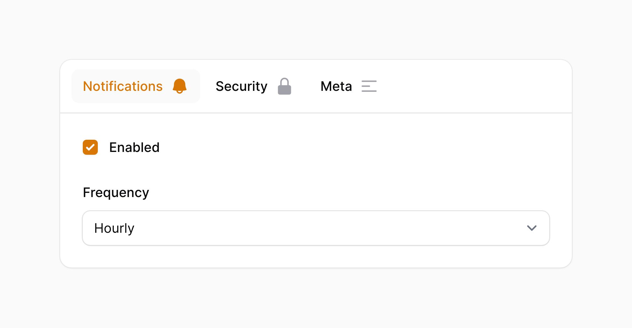
Setting a tab badge
Tabs may have a badge, which you can set using the badge() method:
use Filament\Forms\Components\Tabs; Tabs::make('Tabs') ->tabs([ Tabs\Tab::make('Notifications') ->badge(5) ->schema([ // ... ]), // ... ])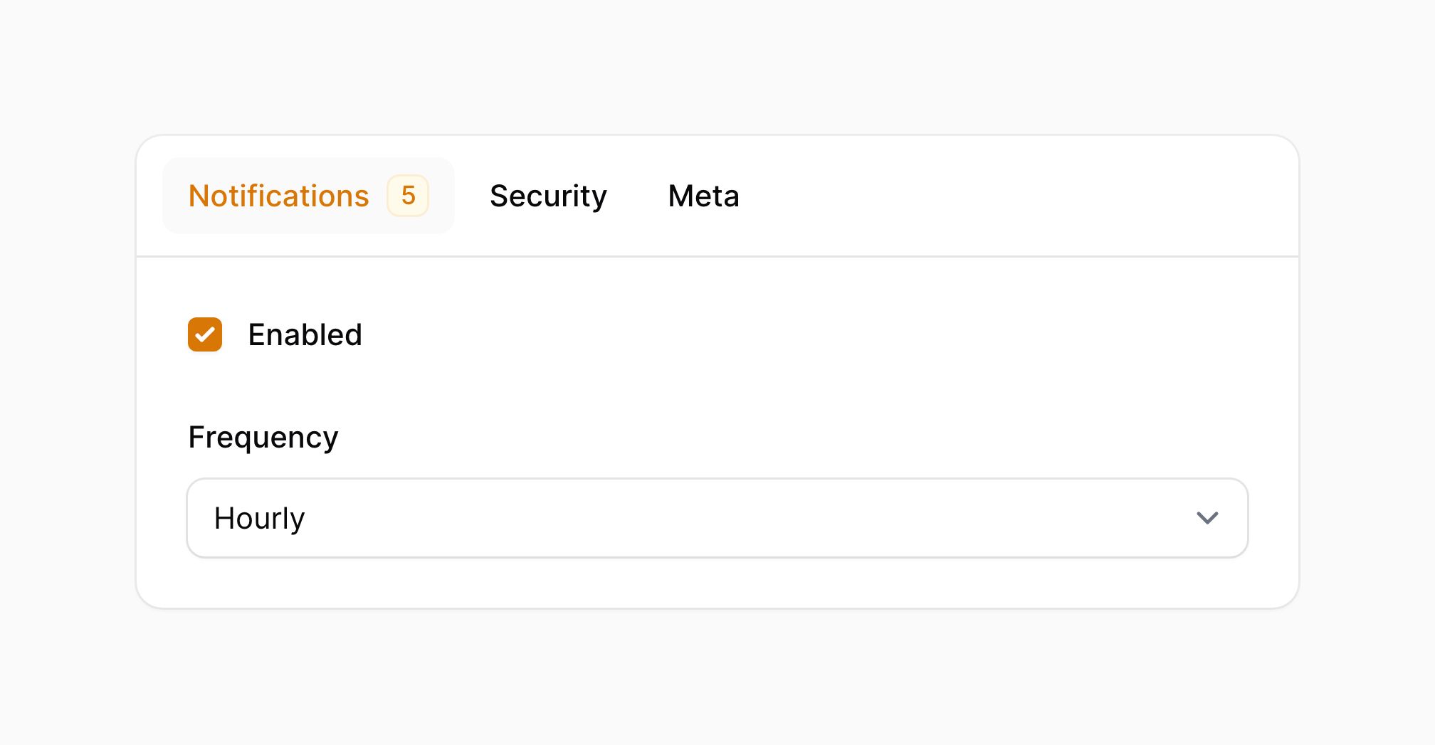
If you'd like to change the color for a badge, you can use the badgeColor() method:
use Filament\Forms\Components\Tabs; Tabs::make('Tabs') ->tabs([ Tabs\Tab::make('Notifications') ->badge(5) ->badgeColor('success') ->schema([ // ... ]), // ... ])Using grid columns within a tab
You may use the columns() method to customize the grid within the tab:
use Filament\Forms\Components\Tabs; Tabs::make('Tabs') ->tabs([ Tabs\Tab::make('Tab 1') ->schema([ // ... ]) ->columns(3), // ... ])Removing the styled container
By default, tabs and their content are wrapped in a container styled as a card. You may remove the styled container using contained():
use Filament\Forms\Components\Tabs; Tabs::make('Tabs') ->tabs([ Tabs\Tab::make('Tab 1') ->schema([ // ... ]), Tabs\Tab::make('Tab 2') ->schema([ // ... ]), Tabs\Tab::make('Tab 3') ->schema([ // ... ]), ]) ->contained(false)Persisting the current tab
By default, the current tab is not persisted in the browser's local storage. You can change this behavior using the persistTab() method. You must also pass in a unique id() for the tabs component, to distinguish it from all other sets of tabs in the app. This ID will be used as the key in the local storage to store the current tab:
use Filament\Forms\Components\Tabs; Tabs::make('Tabs') ->tabs([ // ... ]) ->persistTab() ->id('order-tabs')Persisting the current tab in the URL's query string
By default, the current tab is not persisted in the URL's query string. You can change this behavior using the persistTabInQueryString() method:
use Filament\Forms\Components\Tabs; Tabs::make('Tabs') ->tabs([ Tabs\Tab::make('Tab 1') ->schema([ // ... ]), Tabs\Tab::make('Tab 2') ->schema([ // ... ]), Tabs\Tab::make('Tab 3') ->schema([ // ... ]), ]) ->persistTabInQueryString()By default, the current tab is persisted in the URL's query string using the tab key. You can change this key by passing it to the persistTabInQueryString() method:
use Filament\Forms\Components\Tabs; Tabs::make('Tabs') ->tabs([ Tabs\Tab::make('Tab 1') ->schema([ // ... ]), Tabs\Tab::make('Tab 2') ->schema([ // ... ]), Tabs\Tab::make('Tab 3') ->schema([ // ... ]), ]) ->persistTabInQueryString('settings-tab')Still need help? Join our Discord community or open a GitHub discussion